Living Room Revamp with Farrow & Ball Card Room Green
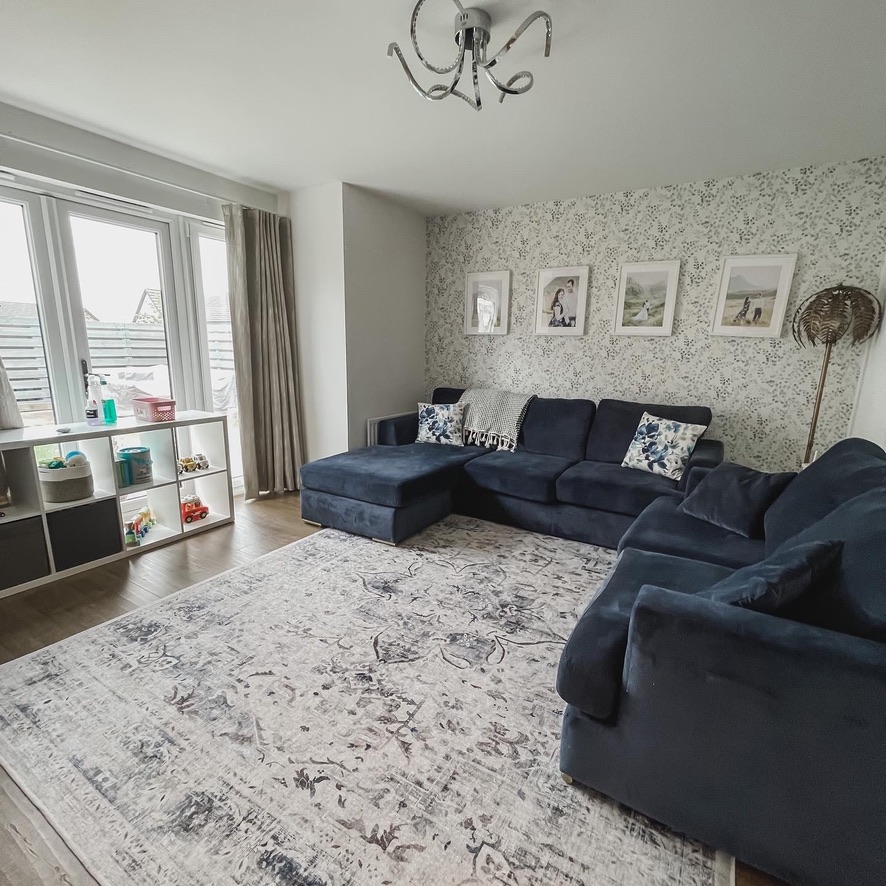
For years, this living room never quite felt like me. It had wallpaper, it looked fine, but it didn’t reflect my style or the atmosphere I wanted to come home to. I’ve always loved the blue velvet sofas, but figuring out what would truly complement them has been the hardest part. I wanted something that felt calm and elevated without clashing with that bold navy tone.
One quiet Tuesday night, my partner suggested this colour. I hesitated at first, but his excitement won me over, and really, it’s only paint, so why not? By Wednesday evening, the swatches were up (we were torn between Pigeon, Card Room Green, and Lichen), and by Thursday the first coat of Farrow & Ball’s Card Room Green was already on the wall.
It’s soft yet rich, moody yet grounded. The perfect green-grey tone that instantly balances out the intensity of the navy sofas while still feeling warm and inviting.
The Paint That Changed Everything
Once I tried Card Room Green on the wall, everything else fell into place. In daylight, it feels airy and serene; by evening, it turns cocoon-like and sophisticated. It gives depth without feeling dark and makes the blue sofas look even more luxurious.
Keeping the Classics
A big part of this revamp was recognising what already worked:
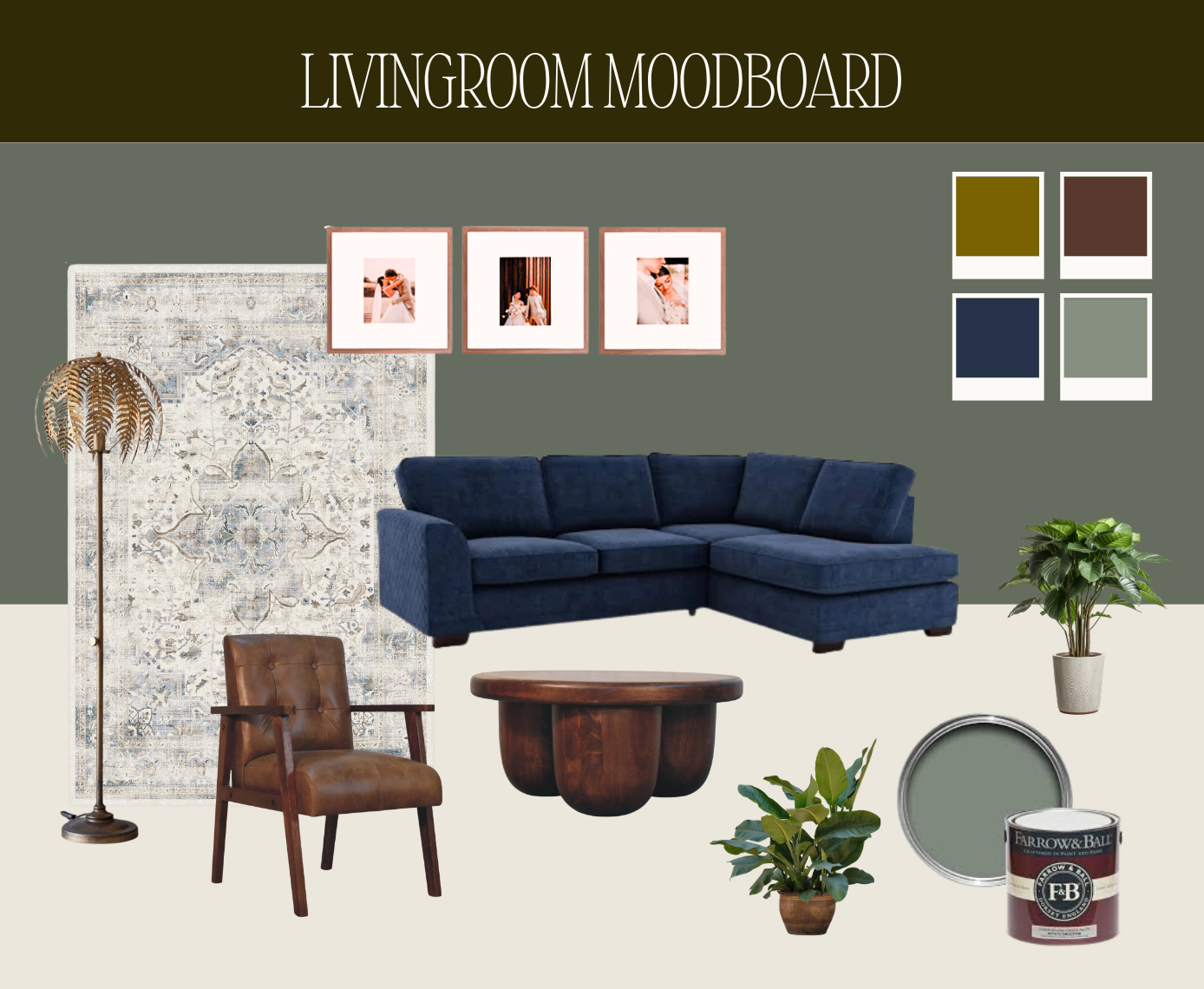
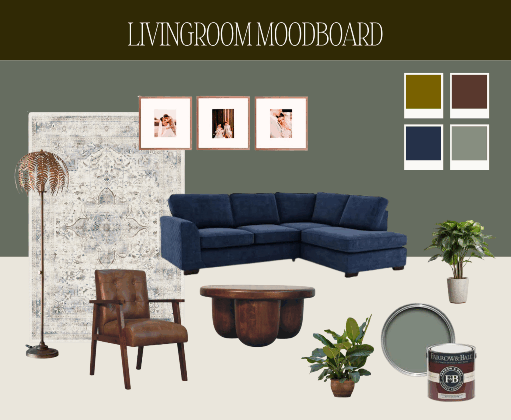
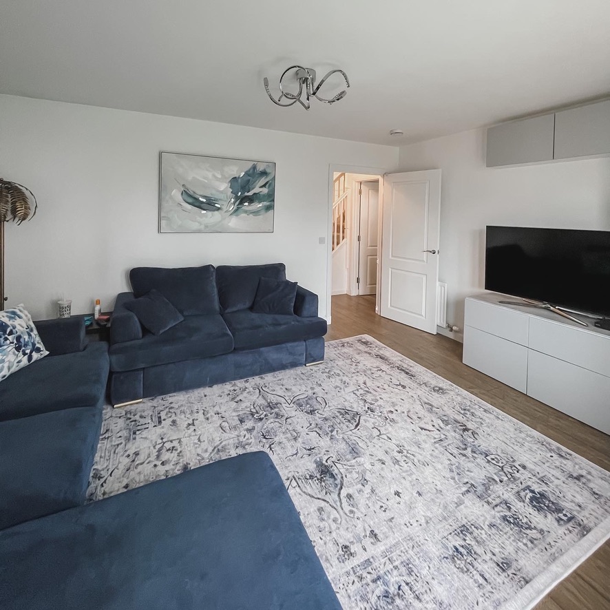
- The navy corner sofas – comfortable, timeless, and the starting point for the entire palette. They are only 5 years old and have plenty of life left in them.
- The neutral blue-patterned rug brings in a layer of warmth and texture without stealing the spotlight from the bolder tones. Since it’s a Ruggable, it’s also practical. If I ever want a change, I can just swap out the topper without replacing the whole thing.
- The antique-style brass palm floor lamp remains as a statement piece, giving off that soft golden glow that works beautifully with the new wall colour.
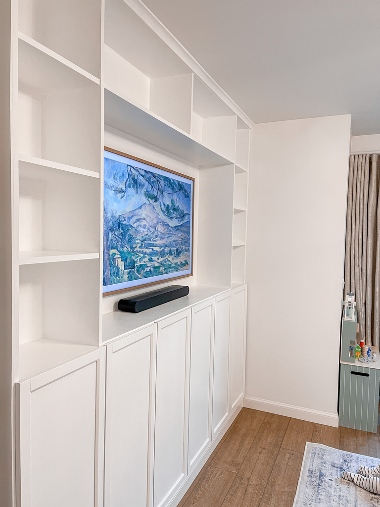
- And of course, the white IKEA Billy built-in bookcase stays. Its crisp white frame contrasts perfectly with the green walls, keeping the space light and balanced (with plenty of storage).
I didn’t need to replace everything I loved, just create a colour story that allowed those pieces to shine.
Warming Up with Wood and Leather
Since the foundation is now cooler (green and blue), I wanted to bring warmth through walnut tones and vintage-style leather. The goal: a layered, lived-in mix that feels grounded but elevated.
I’m leaning toward a mid-century-inspired leather chair, warm brown with character, and a sculptural walnut coffee table. The rounded design will soften the clean lines of the sofa and bookcase, making the space feel more organic and relaxed. I’ll also be hanging large-format photos in natural wooden frames to add warmth and a personal touch.
Layering in Texture and Life
With the main pieces staying in place, this phase is all about creating depth and warmth through thoughtful layering. Texture and tone bring personality to a room and make it feel complete.
- Add textured cushions – the colours are still undecided, but I’m leaning toward warm, inviting tones that complement the green walls and blue sofas.
- Layer in a chunky knitted throw for instant softness and texture.
- Mix ceramic and brass accents to echo the lamp and create visual balance.
- Bring in real plants – their vibrant greens add life and contrast beautifully with the moody wall colour.
Curating the Wall Decor
Because the walls are now such a statement, the art needs to feel curated rather than busy. I’m planning a set of three framed prints above the sofa, using warm wood or brass frames to tie everything together.
Oak gallery frames would complement the palette beautifully without overwhelming the space. Although I'm not sure at this point if I want the photos in black and white, or full colour. I worry full colour will look messy as my children are always dressed in such bright colours (spiderman and unicorn lovers over here!).
Lighting for Warmth and Mood
Lighting can make or break darker paint tones. Since Card Room Green leans slightly cool, I’m focusing on warm ambient lighting to keep the space inviting.
The palm lamp stays, but I’m planning to add a new ceiling light as the main feature. I love the look of Murano glass for a touch of vintage elegance, but with two children playing in the room, I’m still deciding whether it’s a practical choice.
Whatever I choose, warm white bulbs (around 2700K) are essential, they bring out the depth of the paint and make the whole room glow.
Styling the Built-Ins
The white IKEA Billy bookcases pop beautifully against the green walls, and I want to make the most of them. My plan is to fill them with my favourite books, mostly colourful paperbacks and contemporary fiction, to bring life and personality into the space.
- Add books to create visual rhythm.
- Add brass accents, a few plants, and ceramic details to keep it layered and interesting.
- I’m also planning to wall-mount the TV inside the built-ins, making it feel intentional and integrated.
This setup keeps it practical for everyday living while still feeling curated and full of character.
The Progress So Far
Right now, the living room finally feels like it’s starting to come together. It’s freshly painted, and that alone has completely changed the atmosphere. The green shifts with the light throughout the day, sometimes soft and calm, sometimes moody and rich. It already feels like a different space; warmer, more intentional, and much closer to what I imagined.
There’s still plenty left to do: finding the right furniture pieces, styling the shelves, and finishing those final details that make a room feel lived in. But even in this in-between stage, I can already see the vision taking shape, and it’s exciting to know it’s finally becoming the home I’ve always wanted it to be.
