The Living Room Reveal: How Farrow & Ball Card Room Green Transformed Our Space

For six years, our living room was the room we forgot about. You know the one. The space that's technically finished but never actually done. We had builder's white walls, a strip of wallpaper on the back wall that I'd outgrown years ago, and furniture we loved but a space that never quite felt like home. It was fine. It was functional. But it wasn't us.
Then, at the end of November, I asked my partner if we could put up the Christmas tree with the kids. His response? “Yes, but let's do a speedy revamp first so it feels cosy.” I thought he was joking. Spoiler: he wasn't.
What followed was possibly the quickest living room transformation known to man. We're talking paint swatches on a Tuesday and planned it all out, first coat by Wednesday, and a completely transformed space before the weekend. And the result? A living room painted in Farrow & Ball Card Room Green that finally feels like the sophisticated, cosy space I've been dreaming about.
The transformation has genuinely surprised me. I didn't think a quick paint job (and a few extra additions we'll go into in a minute) could make this much difference, but here we are. Today I'm walking you through everything: the paint choice, how we pulled it together so quickly, the styling decisions, and yes, even the things I'd do differently.

Why Card Room Green Was the Perfect Choice
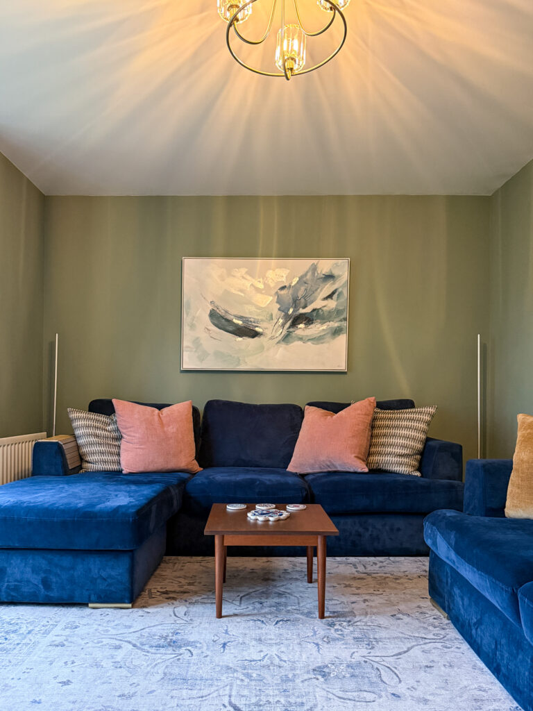
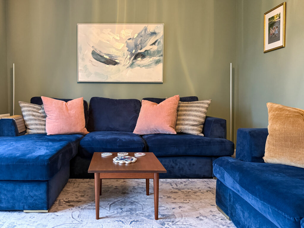
When we first decided to tackle this room, I was terrified. Navy velvet sofas aren't exactly forgiving when it comes to wall colours, and I knew whatever we chose had to work in harmony with that bold blue. We tested Pigeon, Lichen, and Card Room Green, and honestly? Card Room Green won by a mile.
This colour is pure magic. It's not quite green, not quite grey, it's this beautiful moody in-between that feels sophisticated without being too dark. In the morning light streaming through our windows, it has this soft, serene quality that makes the whole room feel calm and airy. But by evening? It transforms into something rich and cocoon-like, the perfect backdrop for cosy nights in with a glass of wine and a good book.
What I love most about Farrow & Ball Card Room Green in our living room is how it makes the navy sofas look even more luxurious. The slightly cool undertones balance out the intensity of the blue velvet, while the warmth in the colour keeps the space from feeling too cold or stark. It's that perfect balance I've been searching for.
The Furniture That Pulled It All Together
Once the walls were painted, it was time to figure out the furniture situation. I knew I wanted to bring in warmer tones to balance the cooler green and blue, so I focused on walnut wood and different fabrics.
The grey armchair was actually a rescue from my partner's flat. It's from Annie Mo's, a brilliant local Scottish brand that makes really high-quality, beautifully designed furniture. When we were merging our homes together, I wasn't sure if his grey chair would work, but against the Card Room Green walls? It's absolutely perfect. The soft grey velvet complements the moody wall colour without competing with the navy sofas, and it's ridiculously comfortable for curling up with my morning coffee.
For now, we're using a small vintage mid-century modern coffee table. It's not the final piece (I'm still hunting for the perfect table), but I love how its warm wood tones add that organic, lived-in feel I was going for. That's the thing about decorating on a realistic budget, you don't have to have everything perfect from day one. It's okay to live with temporary pieces while you find the right ones.
Those Little Details That Changed Everything
Sometimes it's not the big furniture pieces that make a room feel complete. It's all those smaller details that add up to create that layered, luxurious look.
The Cushions
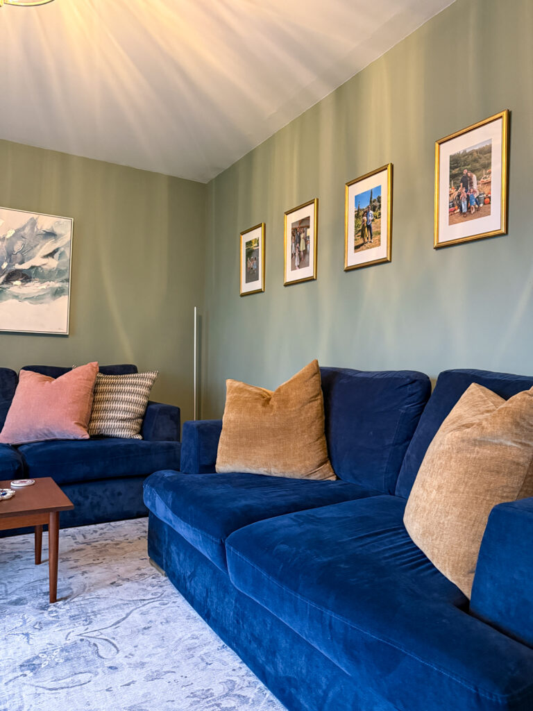
We invested in six massive, really high-quality cushions from Annie Mo's for the sofas. We went with a mix of colours: soft coral pink, warm mustard gold, and some gorgeous textured patterns in a cream and olive. I'll be honest, part of me worried the bright colours would look too busy against the green walls. But they don't. They add exactly the right amount of warmth and personality without overwhelming the space.
This is where the everyday luxury philosophy really comes into play. Yes, good cushions are more expensive than cheap high street alternatives. But they're also something you use every single day, they affect how comfortable you are in your own home, and quality ones last for years. That's everyday luxury that's worth investing in.
The Family Photos
We hung family photos in simple gold frames along one wall, and this was genuinely one of my favourite additions. There's something so personal and warm about having photos of the people you love on display. The gold frames tie in beautifully with the brass accents around the room (more on that in a moment), and they add such a lovely human element to the space.
I went with gold instead of wood or black frames because I wanted something that felt a bit special. Gold can sometimes feel too formal or stuffy, but these simple, clean-lined frames strike that perfect balance between elegant and approachable.
The Lighting Situation
Okay, so this is where I have mixed feelings. We ended up taking the floor lamps from my partner's flat because they sync with the TV (which is incredibly cool for movie nights, I'll admit). But I really miss my beautiful gold brass palm floor lamp that was in the original plan. It was so much more aesthetic and added that vintage, sculptural element I was going for. I also feel it would tie in the photo frames to the room a lot more.
The ceiling light, though? That's a winner. We installed a beautiful antique brass fixture with warm dim bulbs, and the way it casts light around the room completely transforms the atmosphere. Lighting is honestly one of those things that can make or break a darker paint colour. With Card Room Green leaning slightly cool, having warm lighting is absolutely essential. It brings out all those rich, complex tones in the paint and makes the whole room feel inviting rather than cold.
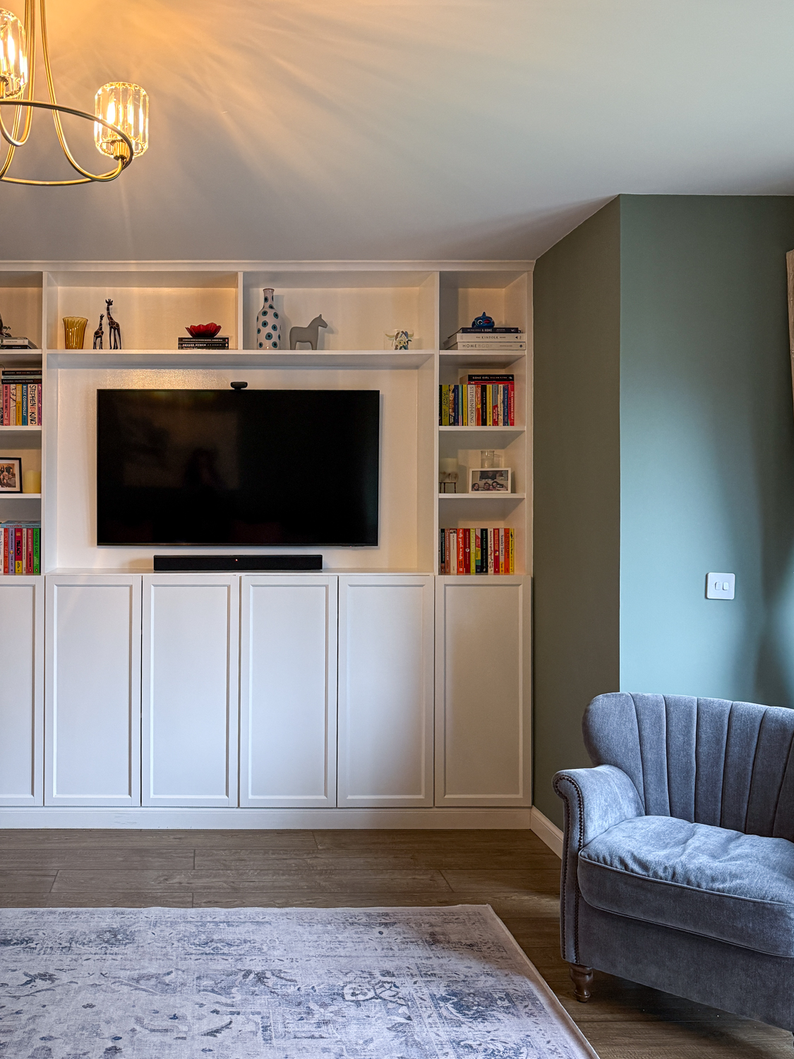
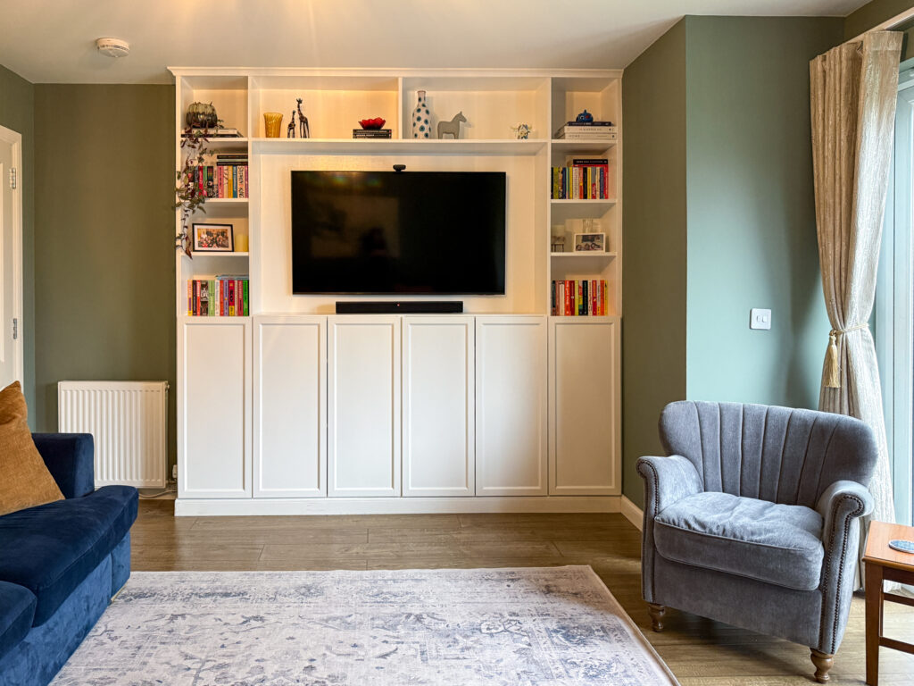
The TV Wall
The Samsung 55″ Neo QLED TV is wall-mounted inside the white IKEA Billy media wall, and we added LED lights behind it that sync with whatever we're watching. Is having the little camera that sticks out from the TV the most aesthetic choice? Probably not. But with two young kids who love movie nights, it's incredibly practical and fun. Sometimes everyday luxury means making choices that work for your actual life, not just what looks good in photos. (and honestly, after about 4 days I stopped even noticing it)
The white built-ins really pop against the Card Room Green walls, and I've been slowly styling the shelves with my favourite books (lots of colourful paperbacks and contemporary fiction), some brass accents, a few plants, and ceramic pieces. It's still a work in progress, but I love how it's starting to look curated and personal rather than showroom-perfect.
The Canvas That I Now Actually Love
Here's a funny thing: I have this large abstract canvas that I hated when it was hanging against white walls in the old room. I was convinced I'd need to replace it or get rid of it entirely. But against the Farrow & Ball Card Room Green? I actually love it now.
The painting has soft blues, greys, and creamy tones that suddenly make so much more sense against the moody green walls. It's become a focal point in the room rather than something I wanted to hide. It's a good reminder that sometimes you don't need to replace everything when you're refreshing a space. Sometimes just changing the context (like the wall colour) can completely transform how you feel about pieces you already own.
What I'd Do Differently
If I'm being completely honest, there are a few things I'd change if I could go back. The lamps are the big one, I really wish we'd kept my original gold fern floor lamp instead of switching to the TV-syncing lamps. Function won over form in that decision, and while it's practical, I do miss the aesthetic of the original.
The family photos are another thing I'm second-guessing. I should have opted for larger frames. Without the tall floor lamp anchoring that side of the room (it's upstairs now since we can't have both the aesthetic gold lamp and the TV-syncing ones), the current gold frames feel a bit small and lost on that big green wall. Something more substantial would create better visual balance and give those family moments the impact they deserve.
The Everyday Luxury of Coming Home
What I love most about this room now isn't any single piece or colour choice. It's how the whole space makes me feel when I walk through the door. It feels calm and sophisticated, but also warm and lived-in. It's definitely luxurious, but it's not precious or untouchable, it's a room for real life, with real kids running around and real coffee mugs left on surfaces.
That's exactly what I wanted: everyday luxury that actually works for our family. A space that feels elevated and thoughtfully designed, but that's also practical and comfortable enough to actually use every single day.
The Farrow & Ball Card Room Green was the catalyst for everything else. Once that paint went on the walls, all the other pieces just seemed to fall into place. The navy sofas suddenly looked intentional rather than random. The grey armchair made sense. Even the rug, which had been fine but not exciting before, now ties everything together beautifully.
Final Thoughts on Creating Your Own Luxurious Living Room
If you're thinking about tackling your own living room transformation, here's my advice: start with one element you absolutely love and build from there. For me, it was the paint colour. For you, it might be a sofa, a rug, or even a piece of art. Let that be your anchor point and trust that everything else will start to make sense once you have that foundation.
Don't be afraid of darker, moodier colours. Yes, they're a commitment, but the richness and atmosphere they create is genuinely worth it. Just make sure you balance them with warm lighting and some lighter elements so the space doesn't feel too heavy.
And please, invest in the things you use every day. Good cushions, quality paint, comfortable furniture, these aren't frivolous purchases. They're the things that make your home feel like a sanctuary rather than just somewhere you sleep. That's the whole point of everyday luxury: making your daily life feel a bit more special without breaking the bank or creating a space that's too precious to actually live in.
I'm so incredibly happy with how this living room has turned out. It finally feels like us, sophisticated but approachable, carefully designed but genuinely liveable. If you've been on the fence about giving your space a refresh, consider this your sign to just go for it. Sometimes all it takes is one bold colour choice to completely transform not just your room, but how you feel about being home.
Leave a Reply
The Sunday Letter
Most Sundays, once the house has gone quiet and it's edging towards nine, a letter goes out. It's the one I'd write to a friend with good taste and not nearly enough time: one thing worth reading, one thing worth buying, and one thing to skip. No noise, no pressure to spend, just the considered version of what I've actually been using, loving, or quietly sending back.
If you like the sort of recommendation that still holds up six months later, leave your email below and I'll write to you on Sunday.