Farrow and Ball Sulking Room Pink: What It Actually Looks Like in a Real Home

There are paint colours you admire from a distance, scrolling through perfectly lit interiors on Pinterest, and then there are colours you live with. Farrow and Ball Sulking Room Pink is one of those shades that genuinely surprised me once it was on the walls. Not because it looked different to what I expected (although it did shift quite dramatically depending on the light), but because of how much warmth and personality it brought to the room. We used it in my daughter's bedroom, and it has turned what was a fairly standard box room into something that feels considered, cosy, and really special.
If you've been eyeing up Sulking Room Pink and wondering whether it's too pink, too brown, or too much of a commitment, this post is for you. These are real, unedited photos of the colour in a real home, in natural light, so you can see exactly what you're getting.
What Colour Is Sulking Room Pink, Really?
Farrow and Ball describe Sulking Room Pink No. 295 as a muted rose, and that's a fair summary, but it doesn't quite capture how complex the colour actually is in person. On the swatch card, it reads as a dusty mauve pink. On the wall, it becomes something much more interesting.
The shade sits somewhere between a warm blush, a soft mauve, and a dusty terracotta, depending entirely on the light in your room. In bright daylight, it leans more obviously pink with a chalky, powdery quality. As the light fades or in corners where natural light doesn't reach directly, it deepens into something closer to a warm cocoa with plum undertones. It's never saccharine, never baby pink, and never cold. That warmth is what makes it so liveable.
The name itself is a nod to the boudoir, a private room historically named after the French “bouder,” meaning to sulk. It's a colour with real depth and a touch of drama, but in the most understated way.
Why We Chose Sulking Room Pink for a Children's Bedroom
When it came to decorating my daughter's room, finding the right pink was everything. She wanted pink (of course she did), but the usual options felt either too sugary or too pale and washed out. What I love about Sulking Room Pink is that it delivers on the pink front for a child, while still feeling grown up enough that the room won't need repainting in three years when her tastes change.
It's sophisticated without being serious. The muted, earthy quality means it works beautifully as a backdrop for colourful children's books, bright toys, and all the general chaos of a little person's space without clashing or feeling overwhelming. The room feels warm and enveloping rather than loud.
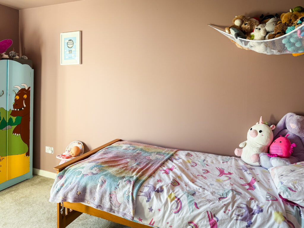
We painted all four walls and the ceiling in the same shade, which I'd absolutely recommend if you're considering this colour. Taking it across every surface creates a cocooning effect that makes the room feel like a retreat. It also means you avoid that slightly disjointed look you can get when a bold wall colour meets a stark white ceiling.

How Sulking Room Pink Changes Throughout the Day
This is the thing that no swatch card or online image can really prepare you for, and it's one of the reasons Farrow and Ball paint is worth the investment. Sulking Room Pink shifts dramatically with the light.
In the morning, when the sun comes through the window, the colour is at its warmest and most obviously pink. There's a soft, rosy glow to the room that feels cheerful without being intense. By midday, the shade settles into something more neutral, almost like a warm blush grey. In the evening under warm artificial light, it becomes the cosiest version of itself, deeper and more enveloping, with those brown and plum undertones really coming through.
My daughter's room faces east, so it gets lovely morning light and then softens as the day goes on. If your room is north facing, expect the colour to lean more towards the brown and mauve end of the spectrum, which creates a beautifully moody atmosphere. South facing rooms will bring out the brighter pink tones. Neither is better or worse; they're just different moods from the same tin.
What Finish to Use
We went with Modern Emulsion for the walls, which is Farrow and Ball's tougher, more washable option. In a child's bedroom, this was non-negotiable. Sticky fingerprints happen, felt tip pen marks are an inevitability, and having a finish that can handle a wipe down without losing its depth of colour makes a real difference.
Modern Emulsion has a slight sheen to it compared to Estate Emulsion (which is their classic ultra-matte, chalky finish), but in practice, the difference is subtle. You still get that beautiful depth that Farrow and Ball is known for, with the added peace of mind that the walls can take a bit of life happening around them.
If you're using Sulking Room Pink in an adult bedroom, living room, or study where durability is less of a concern, Estate Emulsion gives you that gorgeous, completely flat finish that makes the colour look almost like velvet on the wall. For high traffic areas or rooms that need regular cleaning, Modern Emulsion is the smarter choice.
Styling with Sulking Room Pink
One of the biggest strengths of this colour is how well it plays with other tones. It's one of those rare pinks that genuinely works as a neutral, which means you have a lot of freedom with what you put against it.
White Furniture
White furniture looks crisp and fresh against Sulking Room Pink without creating too much contrast. We have a white chest of drawers in the room, and it works perfectly. The warmth of the paint stops the white from looking clinical, and the white stops the room from feeling too enclosed.
Natural Wood
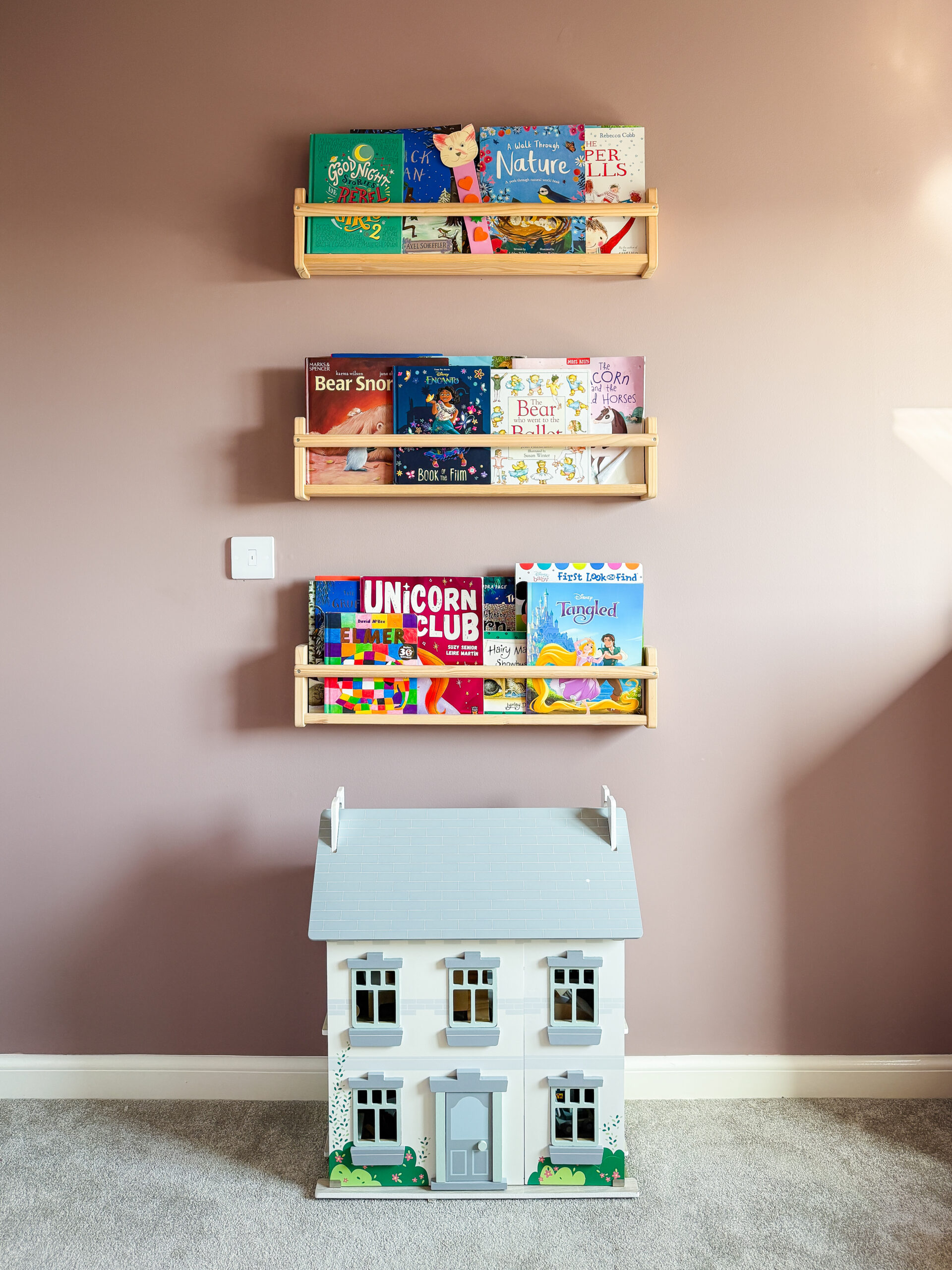
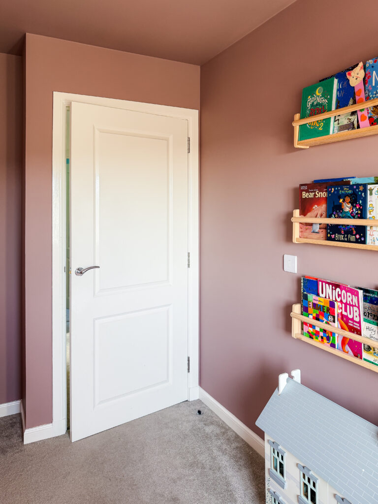
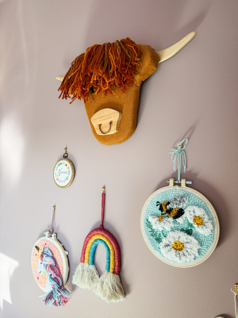
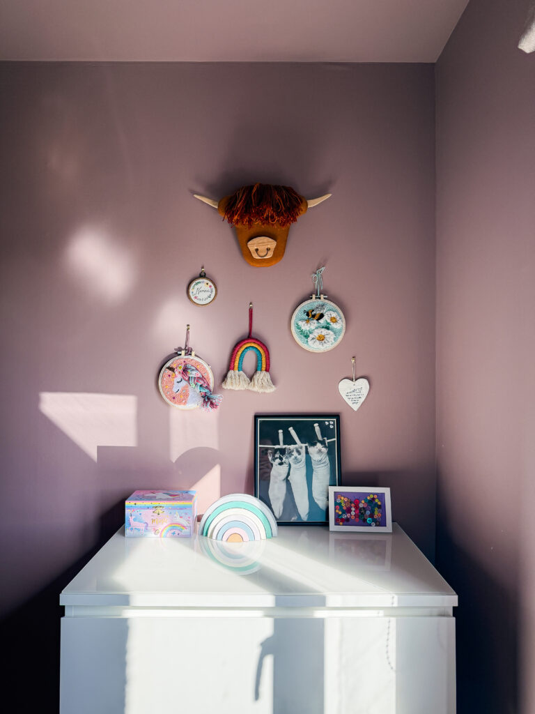
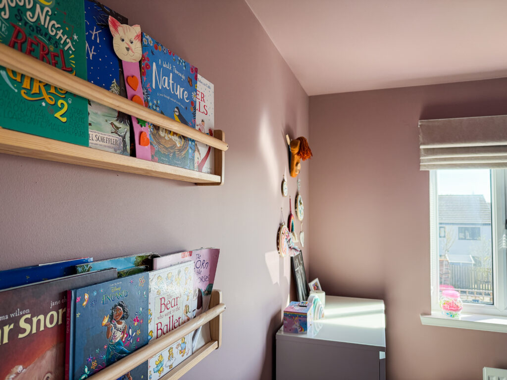
The wooden book ledges on the wall are a lovely pairing. Natural pine and oak tones complement the earthy undertones in the paint, adding warmth on warmth in a way that feels layered rather than flat.
Bold Colours and Patterns
This is where Sulking Room Pink really earns its keep in a child's room. Bright book covers, colourful toys, rainbow accents, and bold patterns all look wonderful against this backdrop. The muted quality of the wall colour means nothing competes. Everything just sits together harmoniously.
Soft Textures
Soft furnishings in complementary tones look beautiful here. Think velvet cushions in burgundy or dusty rose, linen in cream or oatmeal, and cosy throws in warm neutral tones. In this room, the unicorn bedding and pastel blankets work perfectly against the deeper pink walls, proving that you don't need to overthink the coordination. The colour does the heavy lifting.
Storage Ideas That Work with This Colour Scheme
Part of making a children's room feel special rather than chaotic is finding storage solutions that blend with the overall look. A few things that have worked well in this space:
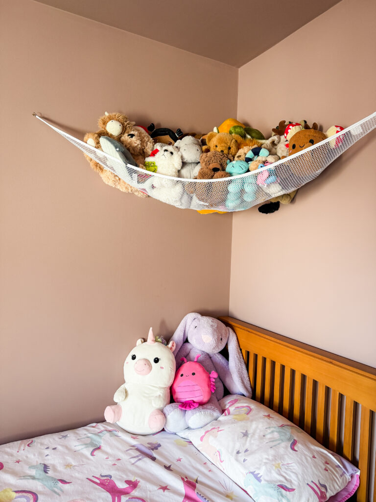
The wooden book ledges keep picture books on display like little pieces of art, and the natural wood tone is a gorgeous complement to the pink walls. A corner net hammock for soft toys keeps the cuddly toy collection visible and accessible without them taking over the floor or the bed. It's one of those brilliantly simple ideas that looks sweet and actually works.
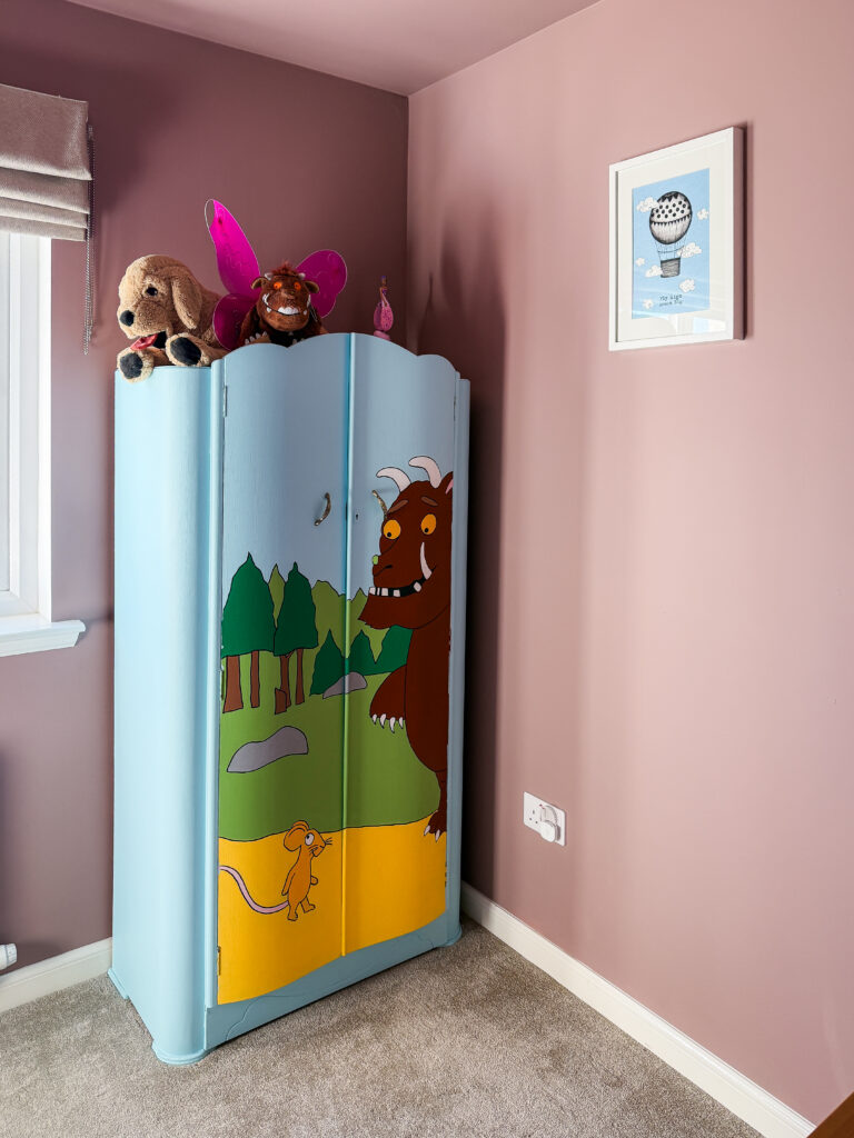
A statement wardrobe adds personality without needing to match the wall colour exactly. Ours is hand painted and it works beautifully as a focal point against the Sulking Room Pink, proving that this shade pairs well with bolder accent pieces too.
Is Sulking Room Pink Worth the Price?
Let's talk about the elephant in the room. Farrow and Ball is not cheap. A 2.5 litre tin of Estate Emulsion will set you back around £57, and for a room this size, you'll need at least two tins (we used two coats on every surface). That's a significant investment compared to a tin of Dulux.
So is it worth it? For this particular colour, honestly, yes. The depth and complexity of Sulking Room Pink is genuinely hard to replicate with budget alternatives. There are dupes available from brands like Dulux and Valspar that come close on the swatch, but the way Farrow and Ball paint responds to changing light throughout the day is something that's difficult to match. The richness of pigment and the way the colour seems to shift and breathe on the wall is where the premium really shows.
That said, if budget is a concern, always order a sample pot first. Paint a large patch (ideally A2 size or bigger) on two different walls and live with it for a few days. Watch how it changes from morning to evening. This is the single best piece of advice for anyone considering any Farrow and Ball colour, because the way these paints interact with light is their defining characteristic, and you genuinely can't judge it from a small swatch.
Sulking Room Pink vs Other Farrow and Ball Pinks
Farrow and Ball have quite a few pinks in their range, and they all do very different things. Here's how Sulking Room Pink compares to the ones people most often get confused between.
Sulking Room Pink vs Setting Plaster: Setting Plaster is much lighter and leans more towards a peachy, plaster pink. It's beautiful as a warm neutral but doesn't have the depth or moodiness of Sulking Room Pink. If Sulking Room Pink feels too bold for you, Setting Plaster might be worth sampling.
Sulking Room Pink vs Peignoir: Peignoir is cooler and more grey-toned. It's a sophisticated lilac pink that reads as much more grey than pink in many lights. Sulking Room Pink is warmer and earthier by comparison.
Sulking Room Pink vs Dead Salmon: Dead Salmon is more overtly brown and earthy, with less obvious pink. If Sulking Room Pink is a pink that acts like a neutral, Dead Salmon is a neutral that occasionally hints at pink.
Sulking Room Pink vs Pink Ground: Pink Ground is much lighter, brighter, and more traditionally pink. It's a lovely choice for a subtle blush, but it doesn't have the drama or the complexity that Sulking Room Pink offers.
Complementary Colours for Sulking Room Pink
If you're planning to extend Sulking Room Pink beyond one room or want to choose woodwork and accent colours that sit well alongside it, here are some combinations that work beautifully. (or you can just go rogue and add a mural painted wardrobe like I did)
For woodwork, Farrow and Ball recommend Skimming Stone as the complementary neutral, and it's a gorgeous pairing. A soft, warm grey-beige that bridges the gap between the pink walls and white ceilings without any jarring contrast. All White and Wimborne White both work well too, depending on how crisp you want the woodwork to look.
For a moodier scheme, pairing Sulking Room Pink with darker tones like Railings on doors or skirting creates a really striking contrast. Deep greens like Treron or Studio Green also look spectacular alongside this shade, and it's a combination that Farrow and Ball themselves frequently showcase in their children's room inspiration.
Would I Use Sulking Room Pink Again?
Without hesitation. It's one of those colours that genuinely makes a room feel like a destination rather than a box. My daughter adores her bedroom, and even as her tastes evolve (we're deep into the unicorn phase right now, and who knows what's next), the wall colour will hold its own because it's not trend-dependent. It's classic, warm, and endlessly adaptable.
If you're considering Sulking Room Pink for a bedroom, a living room, a hallway, or even a bathroom, my advice is to go for it. Sample it properly, give it a few days on the wall, and watch how it transforms through the day. Once you see it in changing light, you'll understand why this is one of Farrow and Ball's most popular shades, and one of my absolute favourites.