Painted ceiling ideas: why a colour overhead can transform a room

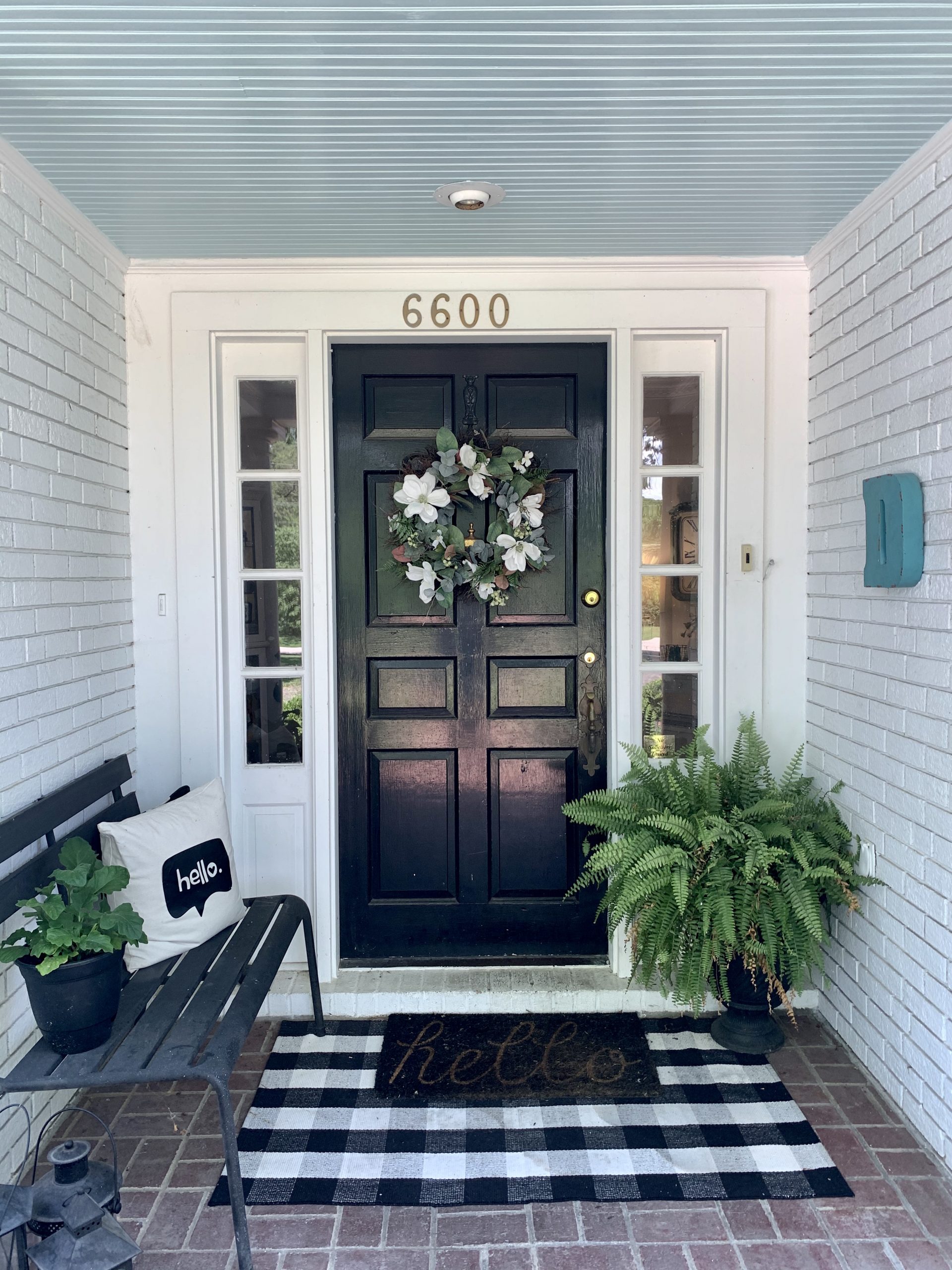
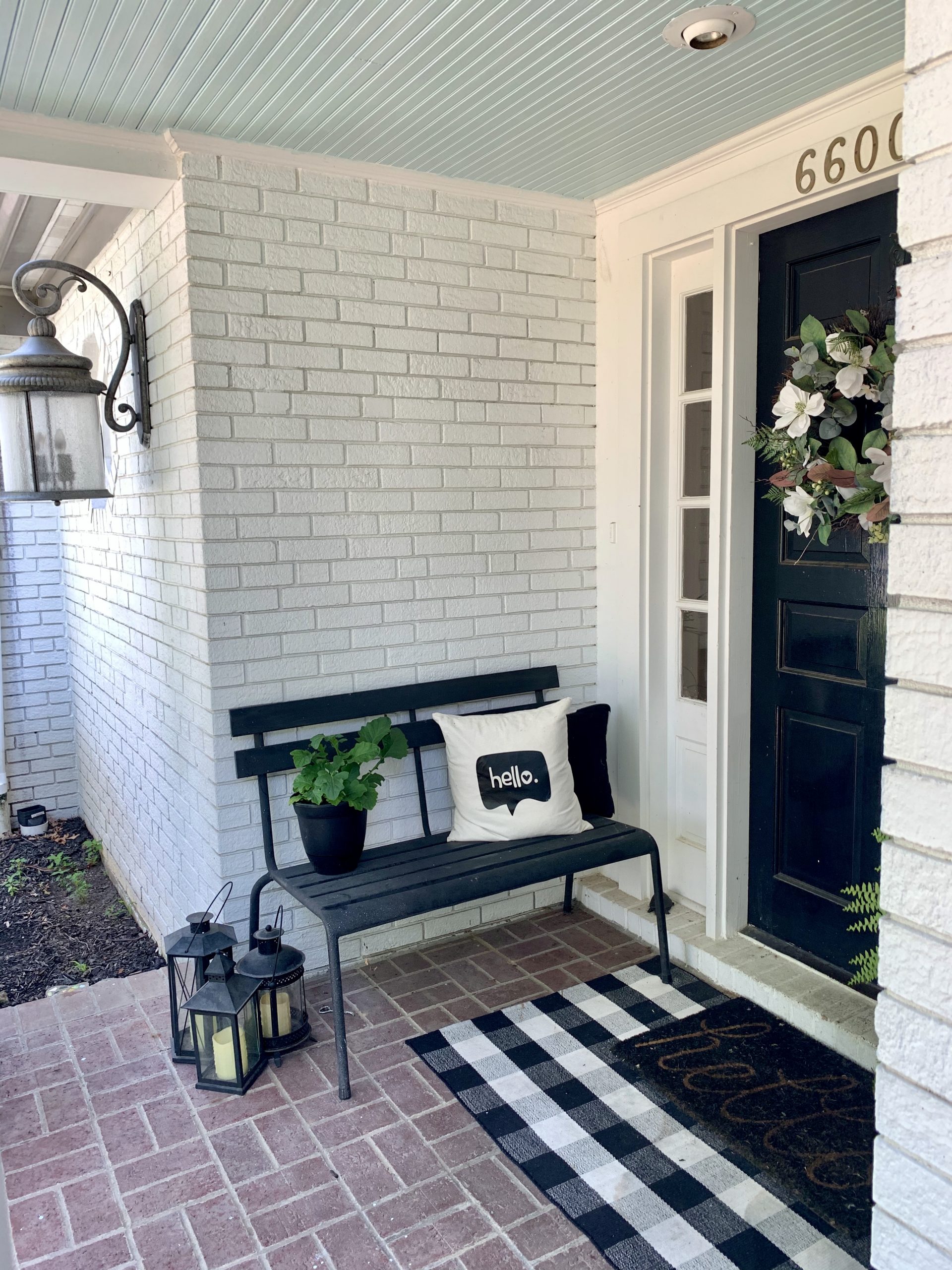
There is a quiet corner of the American South where, for generations, people have been painting their porch ceilings the softest, palest shade of blue. You find it in Charleston, in Savannah, in New Orleans, tucked under the eaves of houses that seem to belong to another century altogether. Look up and you get this gentle sky overhead, even in the middle of a thunderstorm. The tradition has a name: haint blue. And once you have seen it, it becomes very difficult to unsee.
When we painted the ceiling of our own little front porch that same milky, washed-out blue, it was one of those decorative decisions that felt almost absurdly small at the time. A tin of paint, an afternoon's work, the ceiling of a porch so tiny you could cross it in three steps. But the effect was completely out of proportion to the effort. The whole porch softened. The light shifted. It felt, suddenly, like somewhere you wanted to linger.
That is the quiet magic of painted ceilings, and it is one of the most underused ideas in British interiors. We paint our walls in every colour imaginable. We agonise over flooring, over cabinets, over the exact shade of grout. And then we reach for the tin of brilliant white and coat the fifth wall in something the colour of a hospital corridor. If you are looking for painted ceiling ideas for home, the humble haint blue porch is a very good place to start thinking.
The story behind haint blue (and why it still holds up)
The tradition comes from the Gullah Geechee communities of the coastal American South, descendants of West and Central African people who were enslaved on the rice plantations of South Carolina and Georgia. In Gullah folklore, restless spirits known as haints could not cross water. A porch ceiling painted the colour of water or sky was said to stop them in their tracks. The blue travelled upwards from porches to doors, to shutters, to window frames, and eventually into the wider architectural vocabulary of the region.
Some say the colour also confuses wasps and mud daubers, who mistake the ceiling for open sky and look elsewhere to nest. The evidence on that is mixed. What is not mixed is how the colour feels. A painted ceiling in the right shade of blue genuinely reads as a fragment of sky brought indoors, or undercover. It lifts the eye. It holds the light differently than white does. And in a country where proper sunshine is something of a seasonal novelty, that small trick of the eye is worth having.
Which is why the idea translates to British homes rather beautifully, even if the folklore is a long way from home.
Why painting a ceiling works so well
Here is what designers will tell you, and what most of us forget when we are staring at a paint chart. A ceiling is roughly a sixth of the visible surface of a room. Painting it flat white is the visual equivalent of leaving a whole wall blank. You are essentially ignoring an enormous decorative opportunity that is already there, right above your head.
A painted ceiling does three things that are hard to achieve any other way. It draws the eye upward, which makes a low ceiling feel taller and a tall ceiling feel cocooned, depending on the shade. It completes a colour scheme, so the room feels composed rather than interrupted at the top. And it adds a layer of unexpected luxury, because most homes simply do not have them, and the human eye is very quick to register an idea it has not seen before.
These are the hallmarks of everyday luxury, really. Not expensive, not complicated, but considered. One tin of paint and a wet afternoon can change how a room reads for the next decade.
Where painted ceilings work best in a British home
The haint blue porch is the obvious starting point, particularly if you have a covered entrance, a veranda, a summerhouse, or a garden room. Our front porch is barely more than a doorstep with a roof, and the painted ceiling still elevated the whole approach to the house. If you have something larger (a proper porch, a covered outdoor seating area, a converted garage with a canopy) the effect is even stronger.
Inside the house, painted ceilings work beautifully in smaller, more intimate rooms. Downstairs cloakrooms and utility rooms are brilliant testing grounds, because the space is small enough that you can commit without worrying about whether you will love it in five years' time. Bedrooms are the other natural home for this idea. A soft painted ceiling above the bed brings a dreamlike quality to the room, particularly if you already have a calm palette on the walls.
Hallways, bathrooms, and dining rooms all respond well too. The general rule is that any room you use in a contemplative way (where you rest, bathe, read, or gather) is a candidate. Rooms where you are mostly in motion, like a busy kitchen, often benefit more from a crisp white ceiling that keeps the light bouncing.
British paint picks: from Dulux to Farrow & Ball
This is where a bit of practicality comes in. Most of the haint blue paint colours you will see online are from American brands, which you cannot walk into B&Q and pick up on a Saturday morning. So here are the British and British-stocked alternatives, grouped by how they read in the room.
The sky-blue, airy end
For something close to a classic haint blue (pale, cool, with that washed-out sky quality) reach for these.
Dulux Mellow Flow is the standout here, and worth knowing about on its own merits. It is one of three shades in Dulux's Colour of the Year 2026 trio, Rhythm of Blues, and it is the lightest of the three. Mellow Flow is a soft, airy sky blue with just enough grey in it to stop the room reading as nursery. It is an almost perfect British translation of the haint blue tradition, and because it is a Dulux Colour of the Year, it will be stocked everywhere and available in every finish you need.
Farrow & Ball Borrowed Light (No. 235) is the heritage version of this shade. Described by the brand as evoking the colour of summer skies, Borrowed Light is a little more refined than Mellow Flow, with a very faint green undertone that makes it feel quietly sophisticated rather than sweet. It is more expensive, which is the trade-off, but the depth of colour in a Farrow & Ball pot is genuinely different on the wall.
Farrow & Ball Skylight (No. 205) is the slightly more traditional, slightly more saturated sibling. A touch warmer, a touch more present in the room. If Borrowed Light feels too quiet, Skylight adds just enough body to read on a north-facing ceiling where the light is cooler.
The blue-grey, grown-up end
For something with more depth (still blue, but with enough grey to read as considered rather than coastal) these are the ones to sample.
Farrow & Ball Parma Gray (No. 27) is the one to try if you want the haint blue effect without any hint of seaside. Called a grey, but unmistakably blue, it gives you the softness of a painted ceiling with a more architectural, contemporary feel. Particularly good in rooms with existing wood panelling or picture rails.
Little Greene Bone China Blue is a beautiful middle-ground shade, a soft chalky blue with just enough warmth to work in period properties. Little Greene is a proudly British brand, so if you are reluctant to hand everything over to the Dulux and Farrow & Ball duopoly, this is a lovely place to spend your money.
The high-street, budget-friendly end
Because not every paint project needs to be a heritage decision.
Valspar pale blues are mixable at any B&Q, which makes Valspar the quiet hero of anyone doing this kind of project on a sensible budget. Ocean's Froth is a pretty, pale, slightly greenish blue that sits comfortably in the haint blue family, and Valspar's pale blue range runs through every other shade you could want. They also offer a colour-match service, so if you fall in love with a Farrow & Ball shade and the price makes you wince, you can take a chip into B&Q and have it matched. The finish will not be identical, but at a fraction of the cost, it is a very reasonable compromise.
Dulux Mineral Mist and Dulux First Dawn are two widely available pale blues from the standard Dulux range that give you a softer, more budget-friendly alternative to Mellow Flow. Both mix well with warm neutrals and white trim.
Choosing the right shade for your room
A few quick things worth knowing before you commit.
North-facing rooms pull the cool out of any blue and can make pale shades look slightly grey or dishwatery. In these rooms, reach for a warmer blue (something with a hint of green, like Borrowed Light or Skylight) rather than a crisp sky tone. South-facing rooms can handle almost anything, because the warmth of the light softens whatever you put up there.
Low ceilings suit the palest shades, which recede and make the room feel taller. High ceilings can take something with a bit more depth, because the colour reads as atmospheric rather than oppressive. And the classic advice still stands: buy sample pots, paint squares on lining paper, and pin them to the ceiling for a few days before you commit. Ceiling light behaves quite differently from wall light, and a shade that looks perfect on the colour card can read completely differently once it is above your head.
The practical bits of actually painting a ceiling
Worth a quick word on technique, because painting a ceiling is genuinely harder than painting a wall, and a beautiful colour choice badly applied will still look like a beautiful colour choice badly applied.
Work in thin coats. Two coats of a pale blue on a white ceiling will always look better than one heavier one. Use a good roller with an extended handle, and cut in with a brush along every edge before you start rolling. If you are painting a porch ceiling, choose an exterior emulsion formulated for outdoor use. For an interior ceiling, a matt finish almost always flatters the space more than a satin or silk finish, which can show brush marks under the light.
Dust sheets are non-negotiable. So is a second coat.
One tin of paint, properly chosen
The best painted ceilings do not shout about themselves. They just quietly change how a room feels, every time you walk into it. A pale blue ceiling above a porch, a bedroom, a bathroom, or a reading nook is one of those small, confident design choices that marks a home out as thought-through rather than thrown together.
You do not need to commit to the full haint blue tradition. You do not even need to be in a sunny part of the country. You just need one well-chosen tin of paint, a decent roller, and a willingness to look up occasionally. That is the whole idea.
If you are in the middle of thinking through other small home updates that punch above their weight, have a browse of the rest of the home interiors section. There is plenty more in the same spirit.
Leave a Reply
The Sunday Letter
Most Sundays, once the house has gone quiet and it's edging towards nine, a letter goes out. It's the one I'd write to a friend with good taste and not nearly enough time: one thing worth reading, one thing worth buying, and one thing to skip. No noise, no pressure to spend, just the considered version of what I've actually been using, loving, or quietly sending back.
If you like the sort of recommendation that still holds up six months later, leave your email below and I'll write to you on Sunday.