Room By Room~ A Light & Airy Summer Bedroom
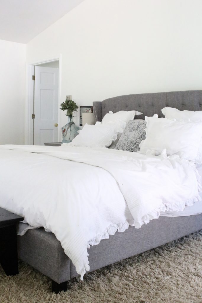
A light & airy summer bedroom space dominated by shades of white.
I’m back for the second week of our summer series called, Room by Room. In this series, you are going to have the opportunity to take a peek into different rooms in our home each week this summer. While visiting those spaces, we hope to share some of our favorite projects already completed, what's on our to-do list for that space and give you tips to make the most of that room in your own home. This is a team effort, so no matter what your style, there's a blogger for you to visit and gather inspiration from. All their spaces are linked at the bottom, so be sure to scroll all the way down and visit their rooms. If you want to look back on last year's Room by Room series, you can find all the rooms I covered in this Organized Office post.
{This post contains affiliate links, see full disclosure here.}
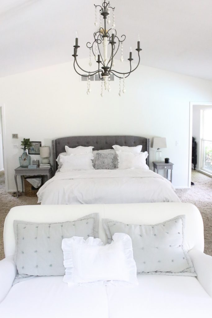
Our master bedroom hasn’t seen many changes since we moved in last fall. After painting it with Alabaster from Sherwin Williams and changing out the light fixture with this gorgeous 6-light candle chandelier from Wayfair (link), we settled in. I know I’ve shown you snippets of it, but not the whole space, so today you’re going to get the full tour!
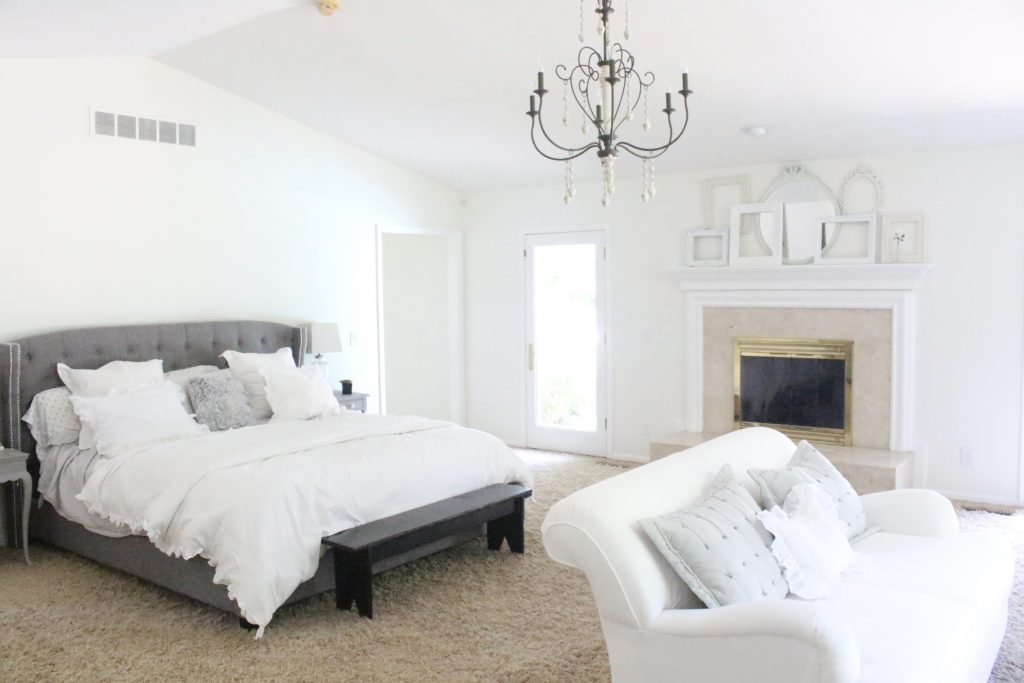
Light & Airy Summer Bedroom
Our bedroom space was kind of overwhelming when we moved in coming from where we were. Our Farmhouse Master Bedroom (link) from our last home was much cozier. The challenge was to make this larger space feel smaller. We decided the best use of our space was to create a sitting area for late night Netflix binging when we are watching our shows without the kids! I also enjoy using this space to read and for quiet time with a cup of coffee. You can see how we created a mini coffee station in this post (link). The built-ins were already there and since I didn't need to have this space for books, I decided to use it for family photos. I love sitting on the chair and reminiscing and looking at our loved ones. It's a nice personalization for our space. Our loveseat (link) and our chaise lounge chair (link) are from Wayfair.
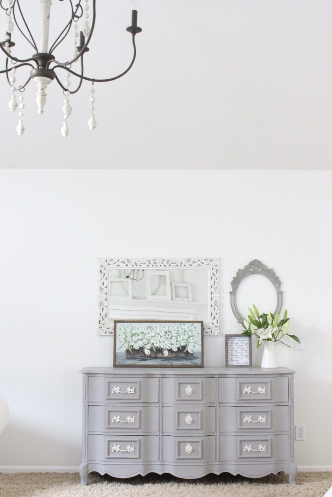
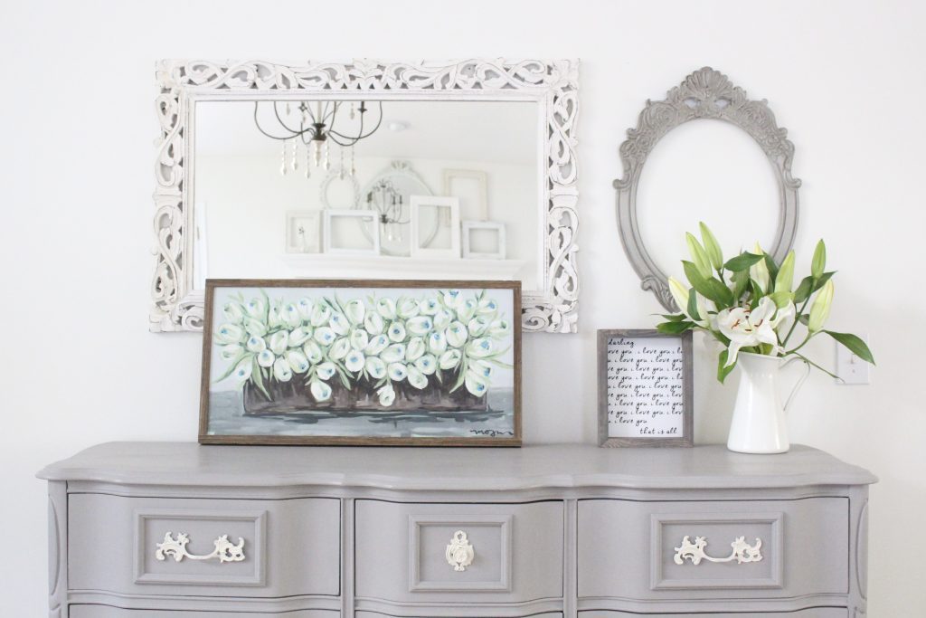
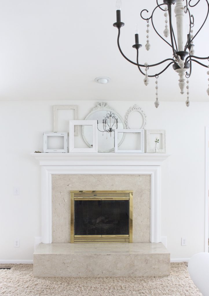
My absolute favorite piece is this gray dresser I bought on the Facebook Marketplace. You can read more about it HERE (Link) The cute i love you sign is from the Sincerely US Shop. I love how the mirror reflects the frames on the mantel!
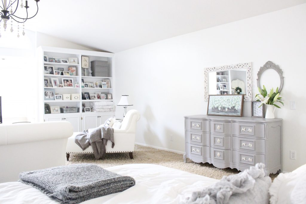
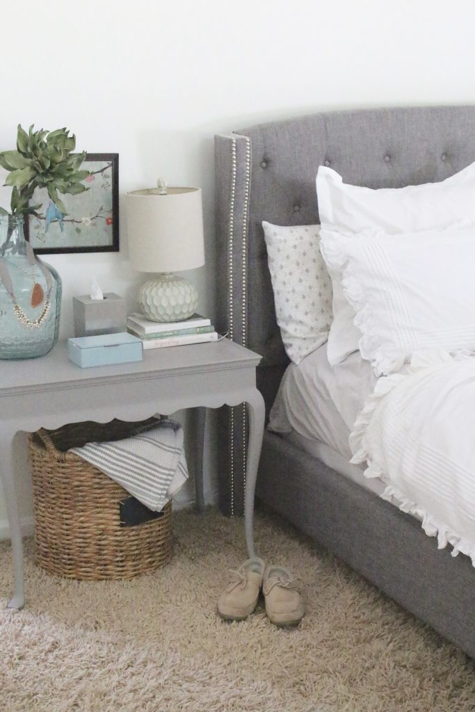
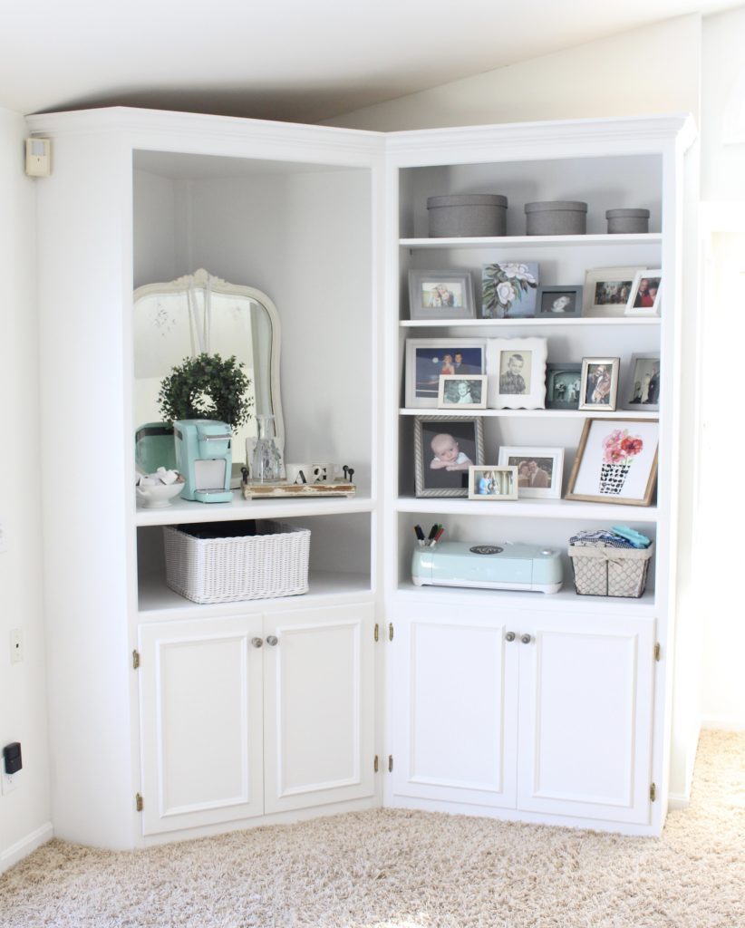
The one thing I hate is this carpet. It is comfy and all, but really hard to keep clean since it's such a thick and long pile. We definitely have new carpet on the update list for the future.
There lots more to see on how this bedroom came together. You can click the links below to go to specific posts.
DIY Projects In Our Light & Airy Bedroom
How to Update a Nightstand with Chalk Paint
Cottage Style Coffee Station in the Bedroom
If you are interested in a similar look for your bedroom, you can shop the links below!
And to see what other bedroom spaces my blogging friends highlighted, check out their inspiring rooms!
[inlinkz_linkup id=790393 mode=1]
To life feeling like home!
XO,




[…] You can see more details of our Light & Airy Summer Bedroom (LINK) here. […]
That is such a wonderful space! It really does feel cozier with the way you’ve set it up. You practically never have to leave now 😉
Oh my goodness, you totally nailed the light and airy feel! I love the mixture of grays and whites – such a beautiful space, Amy! Thanks for hosting this series again this year 🙂
Best,
Kelly
Thank you, Kelly! It’s been such a wonderful space for us to enjoy in the evenings!
Wow what a great bedroom. It really looks like a big space. Your dresser is absolutely beautiful and I love the wall decor you put above it.
Thank you, BonBon. That dresser was an amazing find!
Amy – your master bedroom is gorgeous! The sitting area is a perfect cozy solution to fill the space. And may we say how super-jealous we are of the coffee bar area? Great idea!
Thank you, Vicki! We are really enjoying this space!