Travel Gallery Wall~ A Walk Down Memory Lane
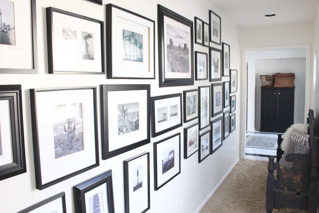
Our travel gallery wall has been a staple in both our homes. This time around, I chose to catalog our travels along a hallway which leads to our master bedroom. I like to call it a walk down memory lane!
One of the very first decorating projects I tackled when we moved into our new home was our travel gallery wall. If you've been following along for awhile, you may remember I had it hanging in our entry along our staircase in our previous home. You can see it here in this post, How to Create a Welcoming Entryway. Since this house is a ranch, we have several very long hallways to decorate, so I definitely knew it was going to find a home in one of them. Our master bedroom suite is humongous. I mean, never what I would have designed, but it was a whole addition to our home from previous owners. In this space, we have a foyer with doors out to the pool area and a narrow hallway lined with windows. It is a beautiful space with lots of natural light. I can see my gallery every time I walk in our bedroom, so it was a perfect fit for my gallery.
I started taking photographs years ago when my husband and I started our travels. We have now been to many beautiful places around the world and I love that this gallery is a visual reminder of all these wonderful trips. Our most recent large trip was to South Africa last summer. You can read these posts about our South African Safari and Capetown travels. It was once in a lifetime and I highly recommend it!
Travel Gallery Wall
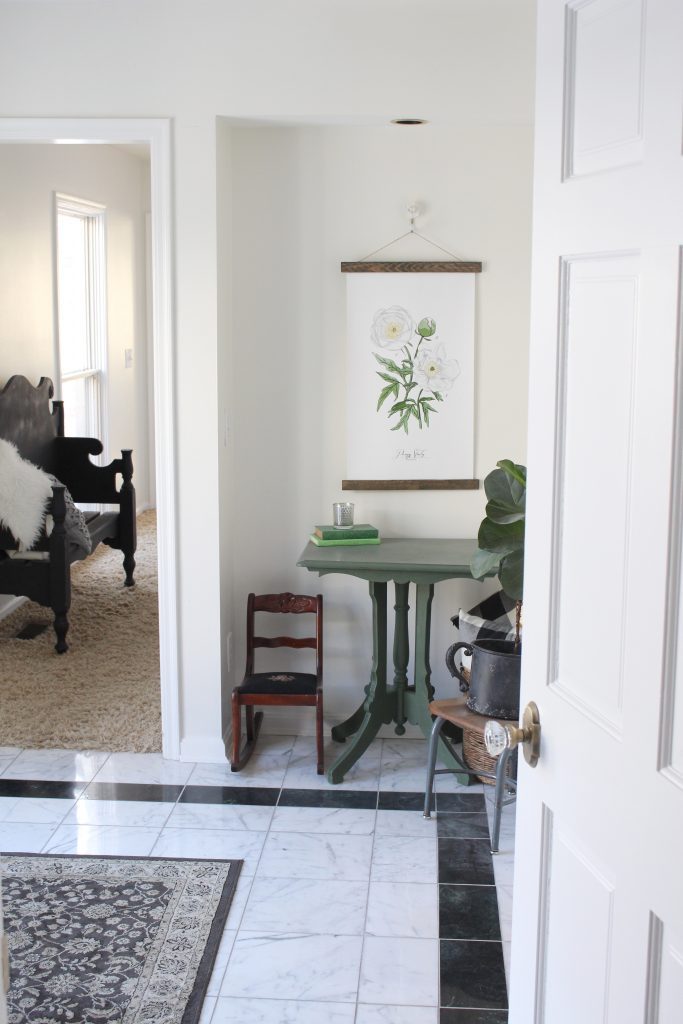
When you enter our bedroom suite, there is a small foyer with doors leading out to the pool and into our bathroom on the right. Straight ahead to the left is our long hallway with our gallery wall. This pretty art was a special piece I received from Vol 25.
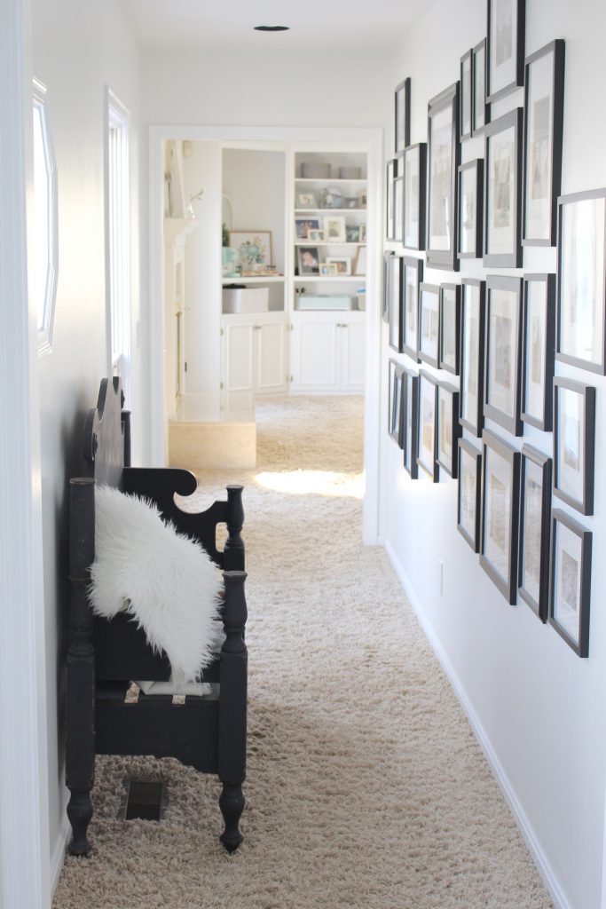
From the bedroom, this is the view down the hallway. The black hutch is from IKEA and I shared more about it in this post. I'm going to use it to house extra towels, goggles, sunscreen etc. that we will need for the pool.
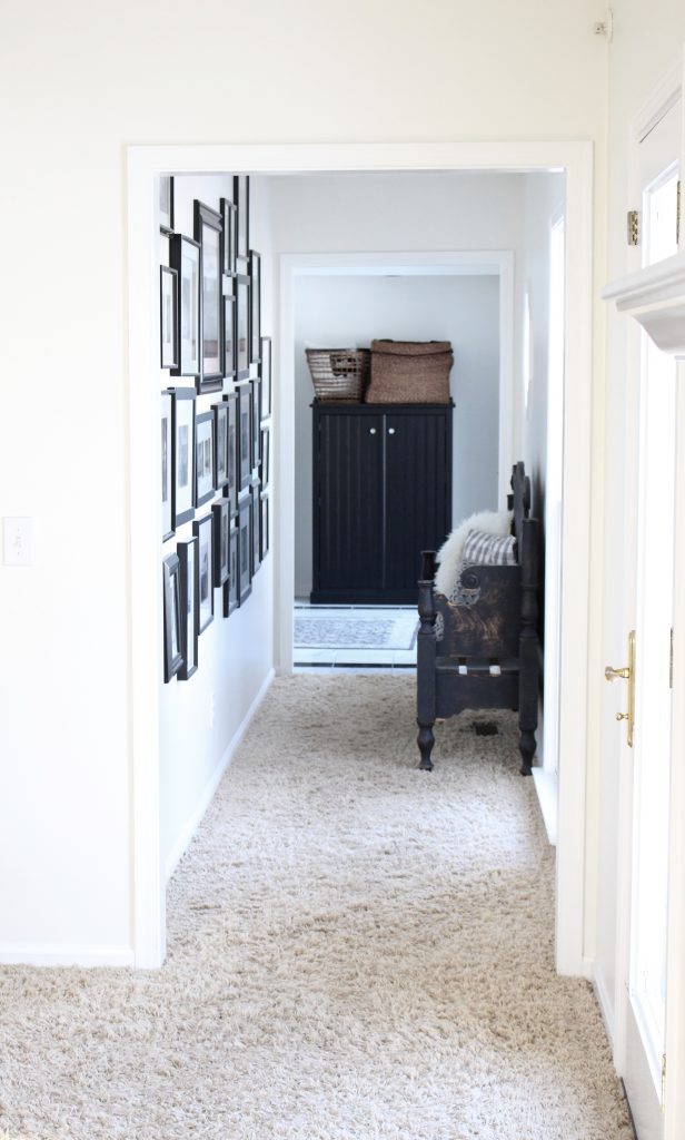
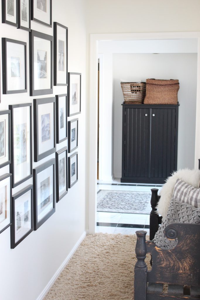
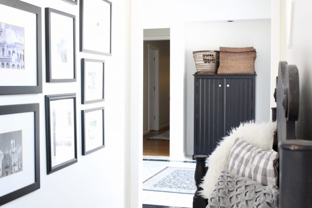
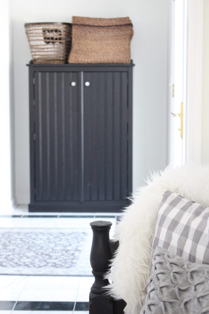
I still love this black bench I picked up at a local antique market. Someone made it using a headboard!
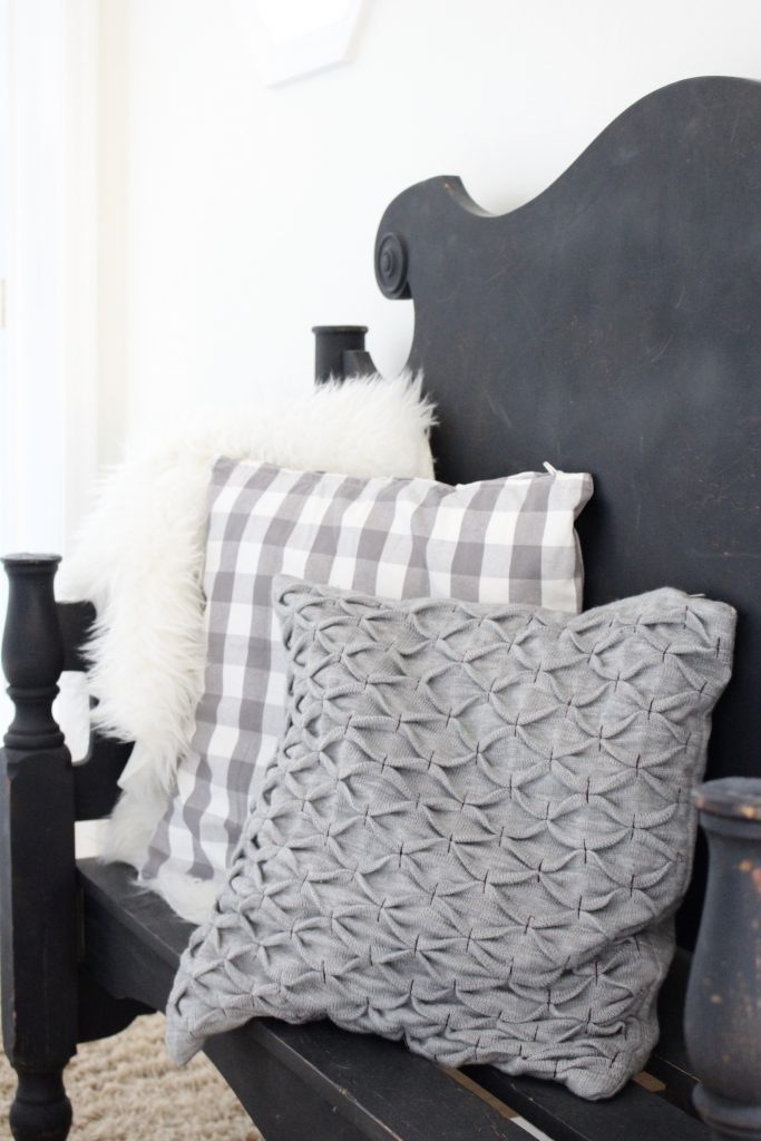
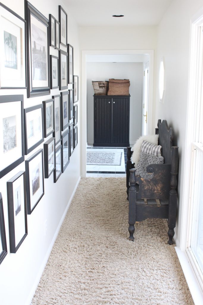
I hate the carpet in the bedroom suite, so it will be changed as soon as we can get the money together. There were more pressing issues to deal with when moving in and the carpet though ugly is still in decent shape.
Our bedroom has a gas fireplace which is one of my favorite features. I decorated it with white shabby chic frames. The bathroom is much larger than our last one, but I don't think it can ever compete with our Modern Farmhouse Bathroom I designed for the last house. We'll see! It's on the renovation list 🙂
To life feeling like home!
XO,

[…] Travel Gallery Wall (LINK) […]
[…] You can read more about our travel gallery wall here, (LINK). […]
Amy, Your Place Looks Great!