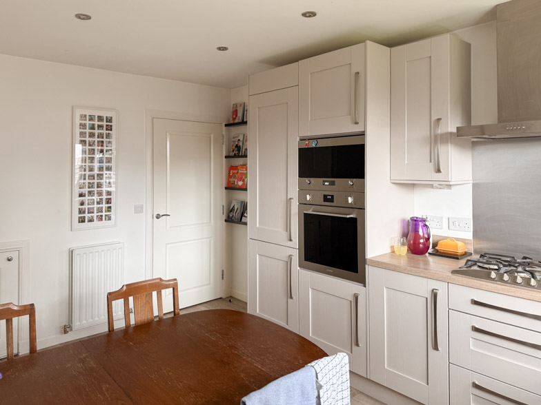
My kitchen cabinets are a light beige with a hint of purple in them. If you have ever tried to find a wall colour that works with beige-purple cabinets, you already know why this post exists.
I have lived with those cabinets for almost 7 years and I have tried, honestly, a lot of things. Every warm white went slightly pink against them. Every grey made them look dirty. Anything with a yellow base made the purple undertone jump out and sit there, sulking. It got to the point where I stopped noticing the problem and just accepted that my kitchen was a room I didn't particularly look at.
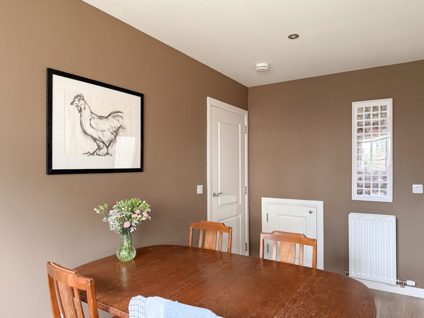
Then I painted the walls Broccoli Brown and the whole thing clicked. So this is my Broccoli Brown kitchen review, including the five other Farrow & Ball browns I sampled first and exactly why each of them lost.

What colour is Broccoli Brown, actually
Broccoli Brown is No. 198 in the Farrow & Ball signature palette. If you have seen it referred to as W108, that is the same paint under its old Archive code. It spent years as a made-to-order archive shade before Farrow & Ball brought it back into the main line alongside Sap Green and Etruscan Red, which was the first time the brand had ever pulled colours out of the archive like that.
Practically, that means two things. It is easier to buy now, it is cheaper than it was as an archive colour, and you can get a proper sample pot rather than committing blind.
The thing that makes it work, and the thing almost nobody mentions when they photograph it, is that it has a small amount of green in it (which you could maybe figure out from “broccoli” in the name). Most browns lean red or orange. That is why so many of them go terracotta on a wall, or read as builder's beige with the lights on. The green in Broccoli Brown pulls it back towards neutral, which is exactly why it behaved itself next to my cabinets when nothing else would.
It is dark, but it is not a statement dark. It sits somewhere between a deep taupe and a soft chocolate depending on what the light is doing, and it shifts quite a lot through the day.

Why walls and not cabinets
Most of what you will find online about this colour is cabinetry. Search it and you will get kitchen island after kitchen island, usually American, usually in a room with three south-facing windows.
I went the other way for a boring reason: my cabinets are fine. They are not the ones I would choose now, but they are in good condition, and repainting a full kitchen of doors is a fortnight of my life and a lot of money for something I would only be doing to fix a colour problem. Painting the walls cost me 1 tin and a weekend.
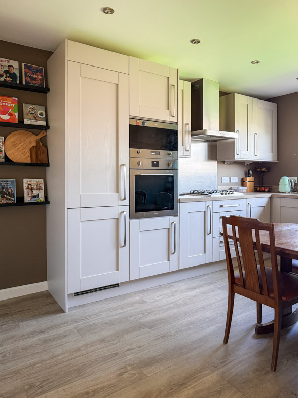
It also turns out that the light cabinets against a dark wall is a much better look than I expected. The beige reads as intentional now. Warm, slightly creamy, deliberate. When the walls were pale, the cabinets were the darkest thing in the room and they looked like an accident. Now they are the light thing in the room and they look like a choice.
The seven Farrow & Ball browns I sampled
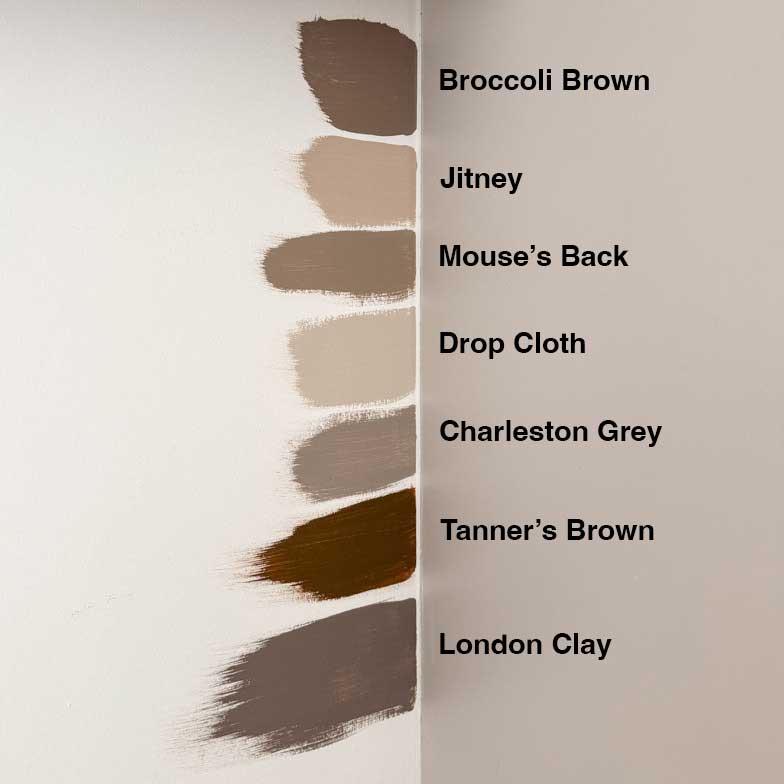
I painted all seven directly onto the wall in big squares, left them up for 2 days, and looked at them at different times of day. Do this. Do not judge a colour on the little card.
Broccoli Brown: The winner, obviously. Deep enough to feel like a decision, green enough not to go orange, and the only one of the seven that didn't fight with the purple in my cabinets. In daylight it reads as a soft dark taupe. Under lamps in the evening it warms up and goes properly cocooning.
Jitney: Too light, and too close to the cabinets. This is a lovely warm greige and if my cabinets were white I might have gone for it. Next to beige it just merged. The room lost all its structure and looked like a slightly smudged version of itself.
Mouse's Back: This was the close one and I sat with it for a long time. It is essentially the same family, just lighter and greyer. Farrow & Ball's own colour expert describes Broccoli Brown as a slightly stronger version of Mouse's Back, which is a fair summary. In my room, Mouse's Back went a bit flat and murky, especially on the wall furthest from the window. If your kitchen is darker than mine or you want something that whispers rather than speaks, this is the one to sample.
Drop Cloth: An instant no from me. It clashed far too much with the cabinets . If you want a low-commitment warm neutral, it is genuinely excellent, but it wasn't the answer to this particular problem.
Charleston Gray: The most interesting near-miss. Charleston Gray has a green-grey quality that I liked a lot on the swatch, but on a full wall it went cold on me. In a north-facing corner it turned distinctly sludgy in the afternoon. Broccoli Brown does the same job with more warmth in it.
Tanner's Brown: Too dark for the space, another instant no from me.
London Clay: Beautiful colour. Wrong room. It has far more red and purple in it than Broccoli Brown, and against cabinets that already have a purple undertone, it doubled down on exactly the thing I was trying to neutralise. It made the whole corner look mauve. Gorgeous in a snug or a bedroom, no use to me here.
What it did to everything else in the room
Here is the bit I did not expect.
I have a chicken drawing that has been on the kitchen wall for ages. On a whaite wall it was just there. Against Broccoli Brown it pops properly, the paper reads as bright, and the frame suddenly looks like it belongs to the picture. Dark walls do this to artwork and it is one of the most underrated reasons to paint a room a deep colour.

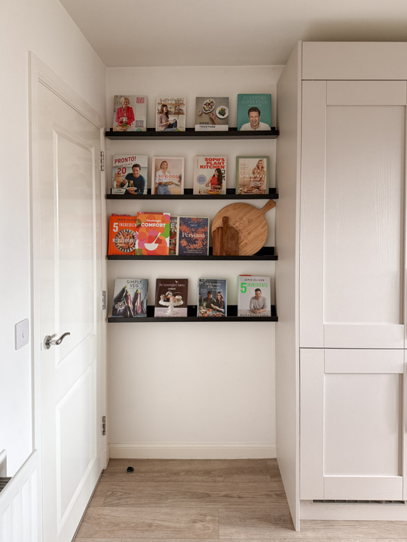
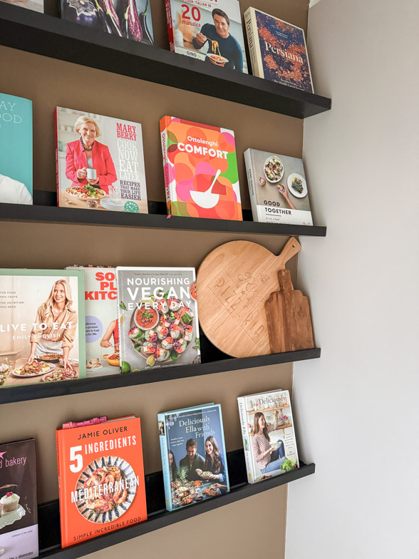
The cookbook nook I made with IKEA picture ledges went from being a nice bit of storage to being the actual feature of the room. The shelves have depth now. If you have open shelving anywhere in your kitchen, a dark wall behind it will do more for it than anything you could buy.
Brass hardware, wooden boards, anything with a bit of texture: all of it improved. That is the general rule with this colour. It rewards natural materials and it makes anything shiny look better.

Living with it
A few things worth knowing before you commit.
It is dark, and dark walls need light. I have spotlights throughout the kitchen and I would not want this colour in a kitchen with a single ceiling pendant. If your current lighting is one bulb in the middle of the room, budget for lamps or under-cabinet strips before you budget for paint.
The colour moves a lot. Morning light and 9pm lamplight give you two quite different rooms. I like this, but if you are someone who wants a colour to look the same all day, sample it hard first. In the afternoon it even casts a greenish shadow on the roof from where it bounces off the top of the cabinets. Not really noticeable unless you are trying to photograph it, but it's quite nice.
Coverage was 2 over white (with food and finger print stained walls), and I used dead flat. Kitchens want something wipeable, so check the finish before you order rather than assuming.
And it does show marks near the hob. less than 48 hours after painting there are already oil blobs on the wall. Not badly, and less than a flat white would, but keep a bit of paint back for touch-ups. The next project, kitchen wall tiles hopefully.
Would I do it again? Yes, and faster. I spent years trying to work around those cabinets when the fix was to stop treating the walls as the neutral and let them be the colour instead.
Broccoli Brown FAQs
Not necessarily, but it depends far more on your light than your square footage. A small kitchen with good natural light and decent lamps will handle it. A small kitchen with one window and one ceiling bulb will feel closed in. Sample it on the darkest wall you have, not the brightest.
Warm off-whites, cream, oak and walnut, brass, unlacquered nickel, natural stone, linen. It is happiest surrounded by texture. It also works well with soft pinks and clay tones if you want a bit of contrast, and with deep greens if you want something moodier.
Yes. W108 was the Archive code. It is now No. 198 in the signature palette, which means it is stocked as standard rather than made to order.
Better than most browns, because the green in it stops it going muddy the way red-based browns do in cool light. It will read cooler and greyer than it does in south-facing light, so expect a slightly more taupe result.
Sample both. Mouse's Back is the lighter, softer, more forgiving version. Broccoli Brown has more depth and holds up better in a room with a lot going on. If you cannot decide, the deciding factor is usually how dark your room already is.
Leave a Reply
The Sunday Letter
Most Sundays, once the house has gone quiet and it's edging towards nine, a letter goes out. It's the one I'd write to a friend with good taste and not nearly enough time: one thing worth reading, one thing worth buying, and one thing to skip. No noise, no pressure to spend, just the considered version of what I've actually been using, loving, or quietly sending back.
If you like the sort of recommendation that still holds up six months later, leave your email below and I'll write to you on Sunday.