Designer Lingo Unplugged: Contrast

I am not a trained Interior Designer. Though, I have been passionate about home decor, space planning, and making my home a cozy and warm place for my family as long as I can remember. I never went to school and studied the ins and outs of design and I know many of you haven't also. I like to say I have a design degree in HGTV :). I think Decorating on a Dime and Decorating Cents have been my education along with numerous books and magazines that I've poured over for years. Sometimes the design lingo thrown around can be very overwhelming. I know it confuses me, so I thought it would be fun to do a series and unplug some of those concepts here on the blog. Words like, contrast, balance, scale, focal point, vignette, and mood all mean something when it comes to stylizing your home. I hope to show you in “layman's” terms what each of these means and how you use them to decorate and style a room.
CONTRAST: the state of being strikingly different from something else, typically something in juxtaposition or close association.
If contrast means being strikingly different, then we are talking the opposites of each other.
This translates into decorating in four ways.
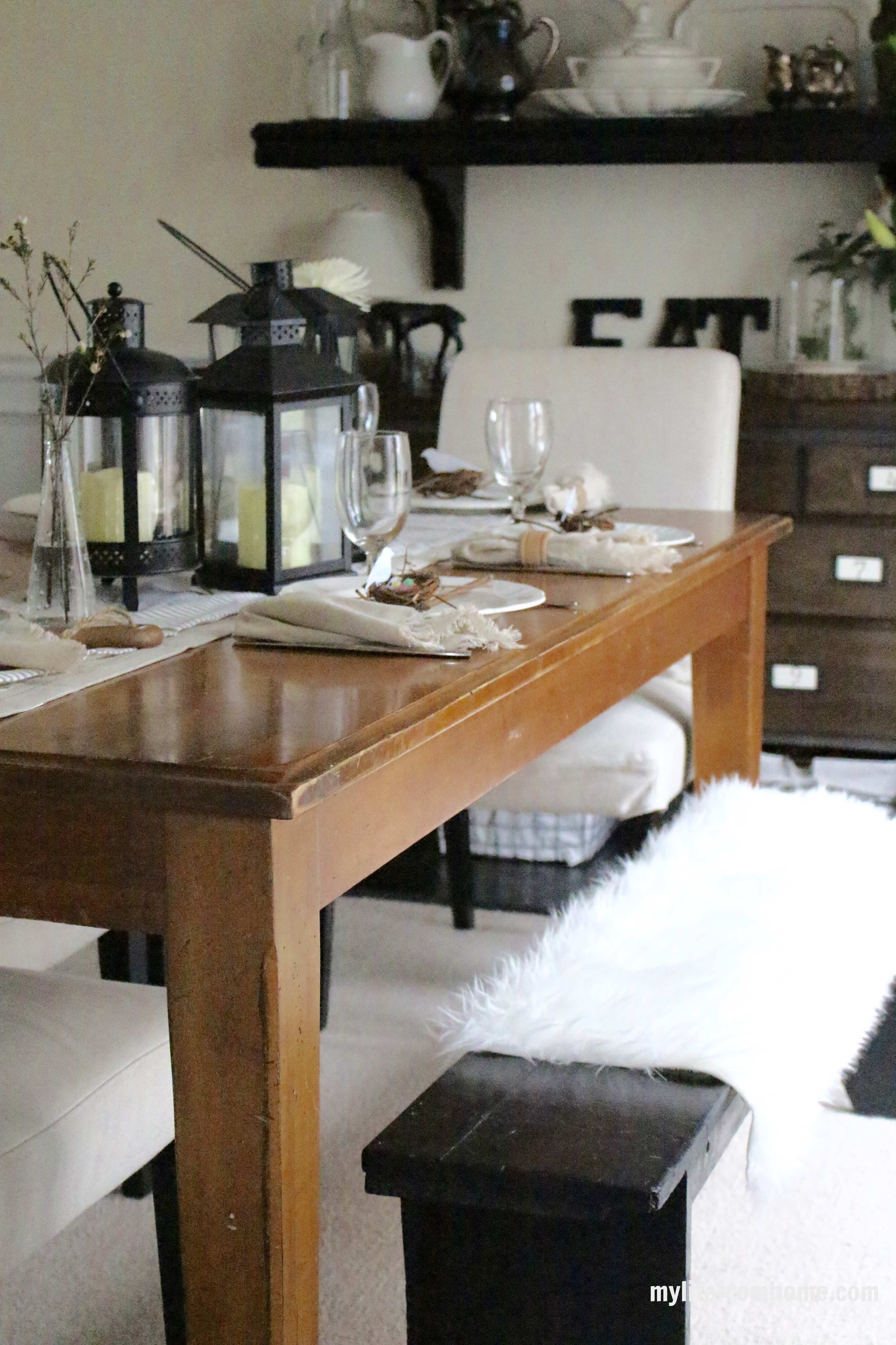
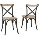
1. Pair opposite colors together: I love pairing black and white. I do this all over my home. It's my favorite color combination to put together because of this contrast. Here are some examples from my home. I use these two colors in both large pieces and smaller decor pieces. Creamy white walls paired with black wrought iron fixtures or furniture is the perfect contrast.
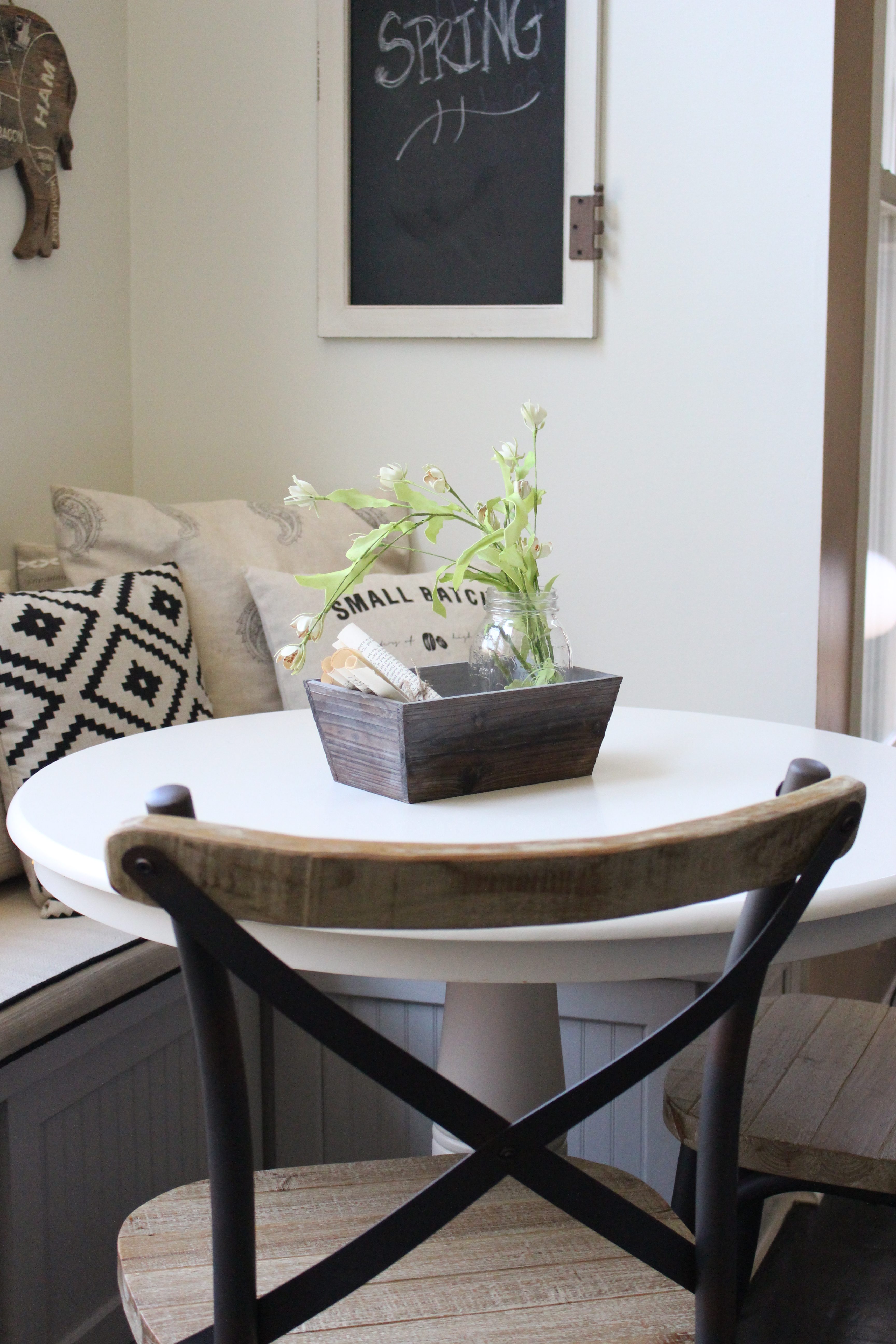
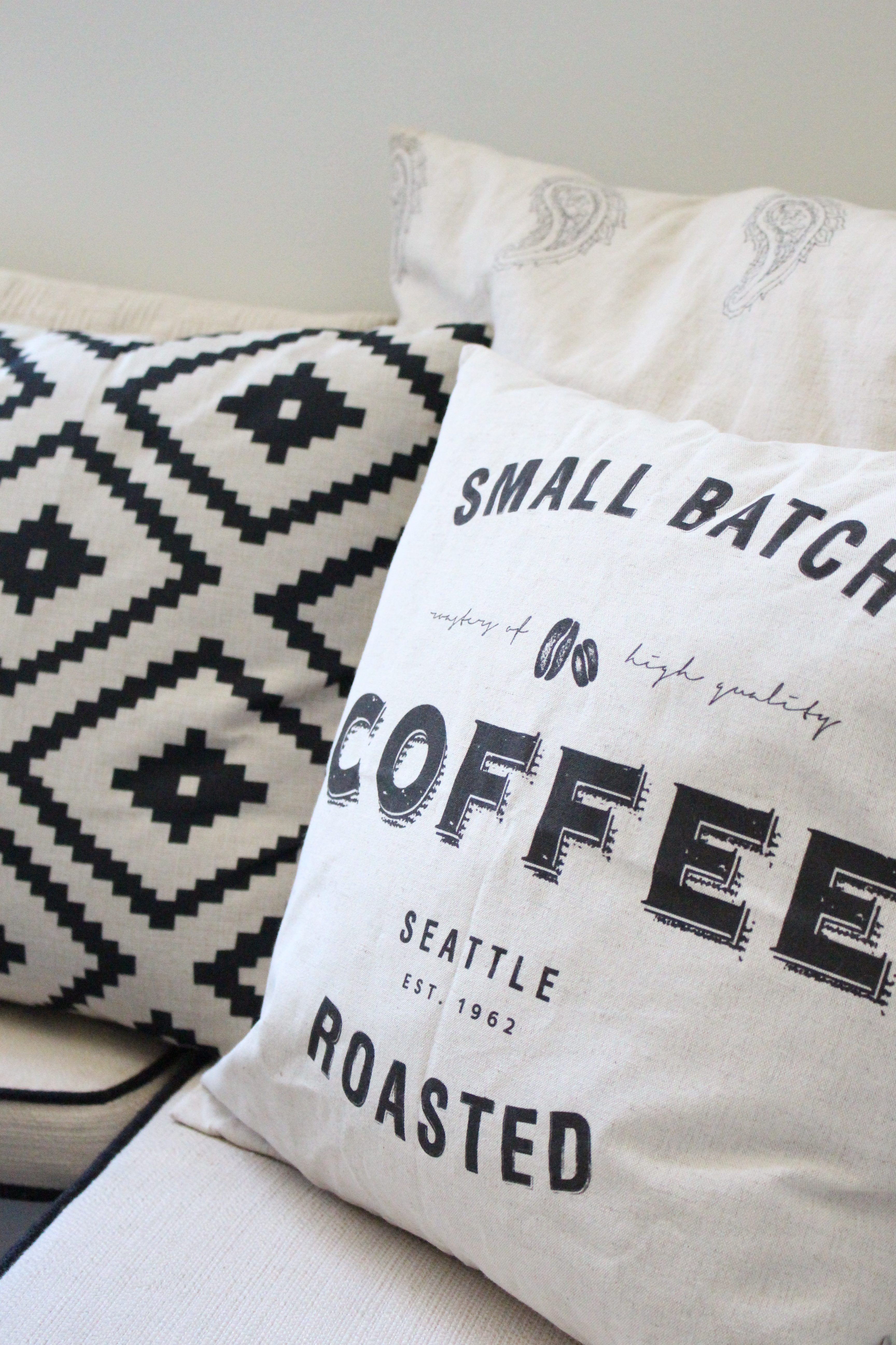
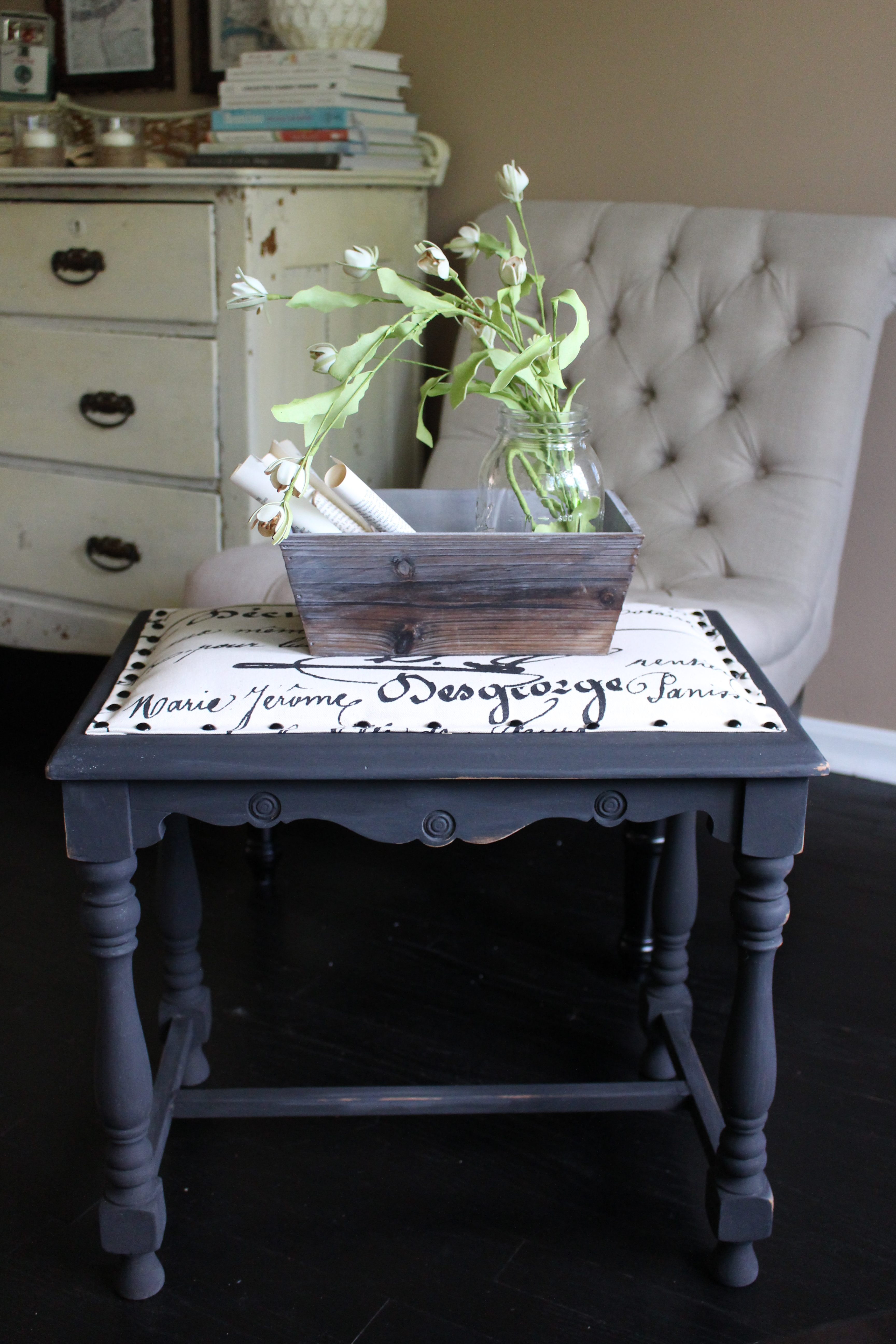
Black and white are a good pairing, but you can also look at a color wheel and colors across from one another are perfect colors to contrast. Colors such as gold/ mustard and blue or kelly green and magenta. In addition, variations of your darker colors paired with white are also chic. A hot mix right now is navy and white or hot pink and white.
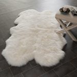
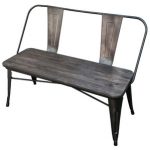
2. Blend soft and hard furnishings: I love mixing things up in my home and blending soft and hard furnishings creates visible interest in your spaces.
Here I have taken my hard black wooden bench and softened it with a faux sheepskin throw and a mix of pillows.
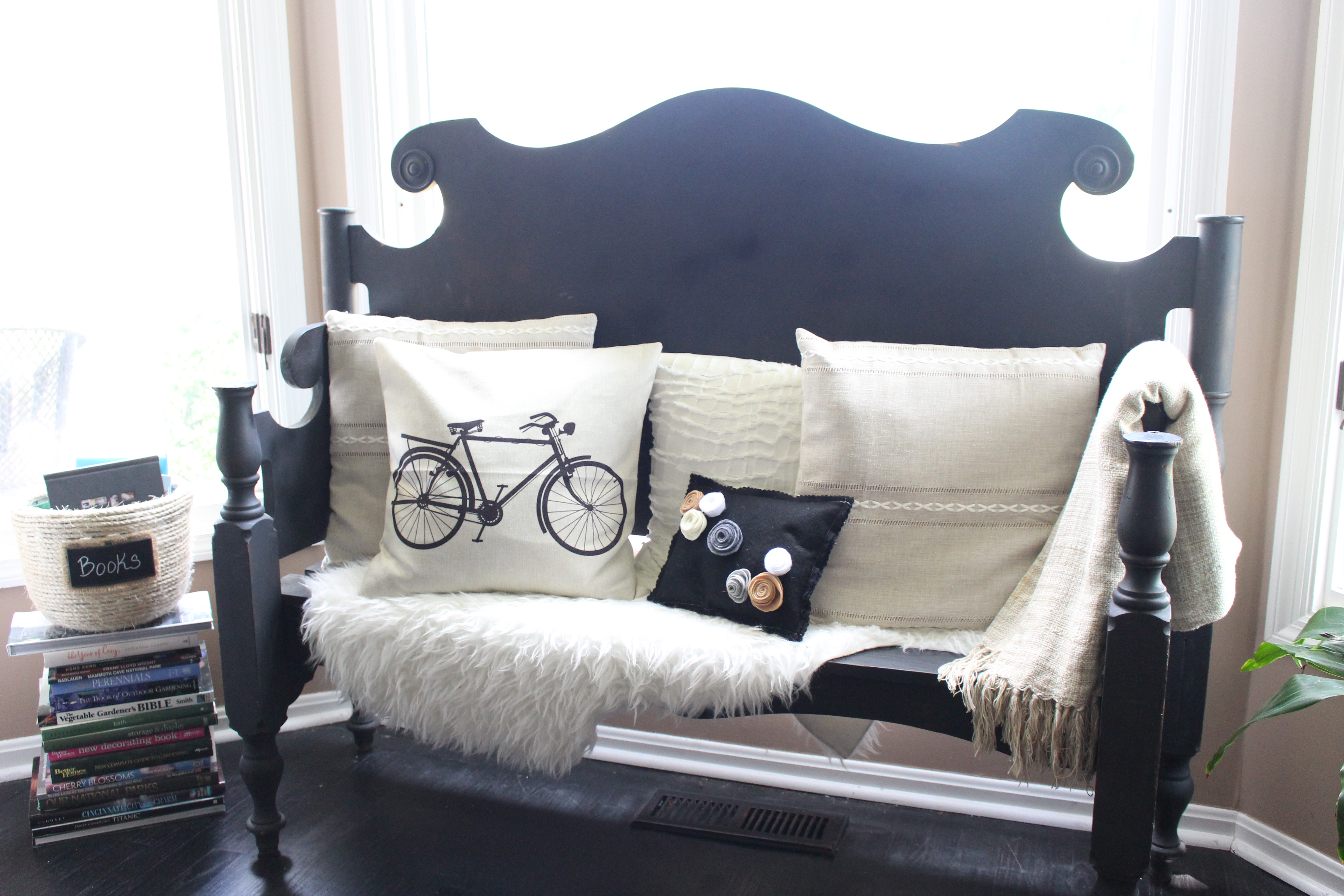
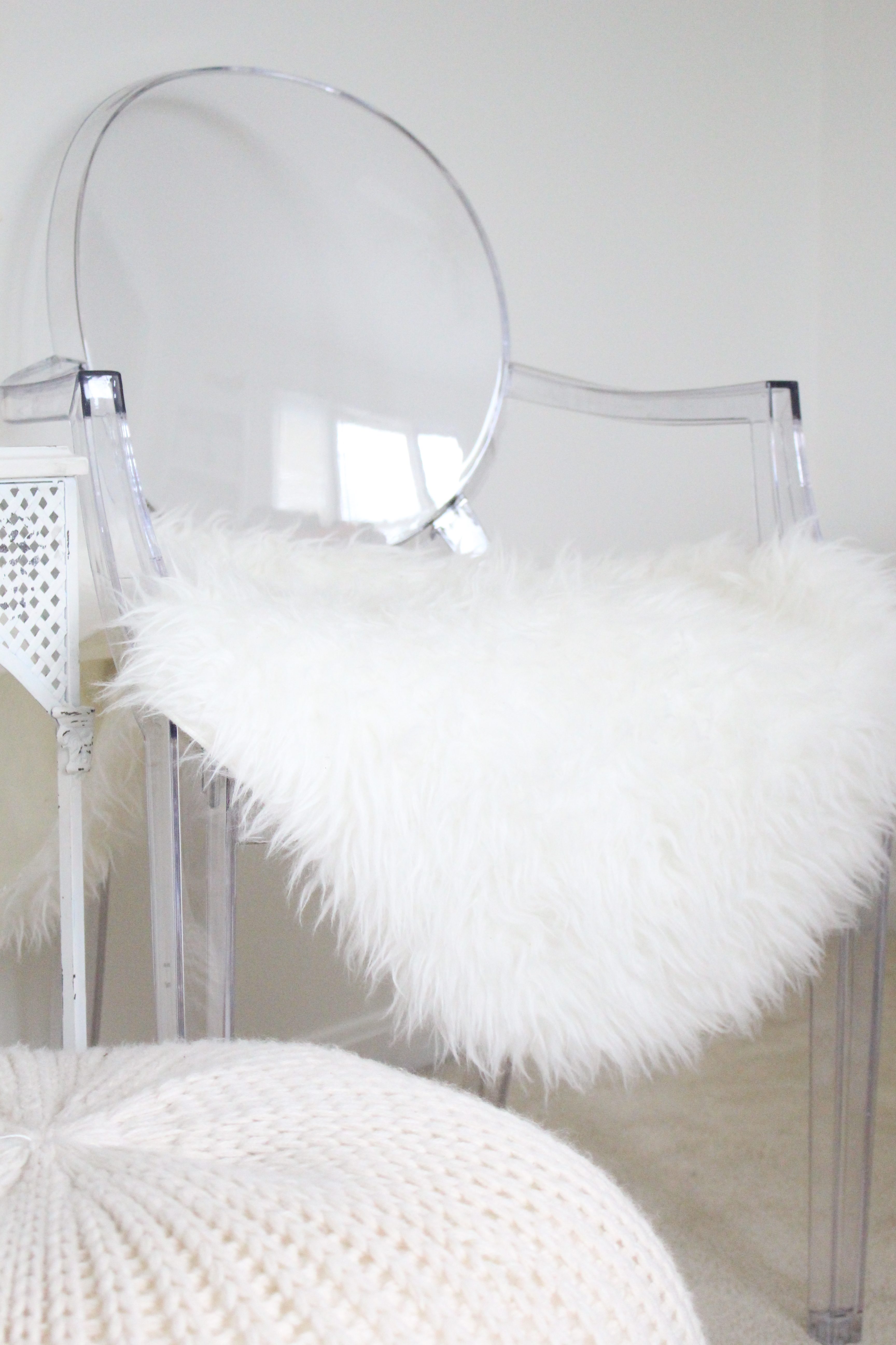
Another way I like to use contrast of hard and soft is by putting industrial items in my decor. I love wrought iron, stone, and rustic items, but they can tend to be cold if not balanced with soft furnishings.
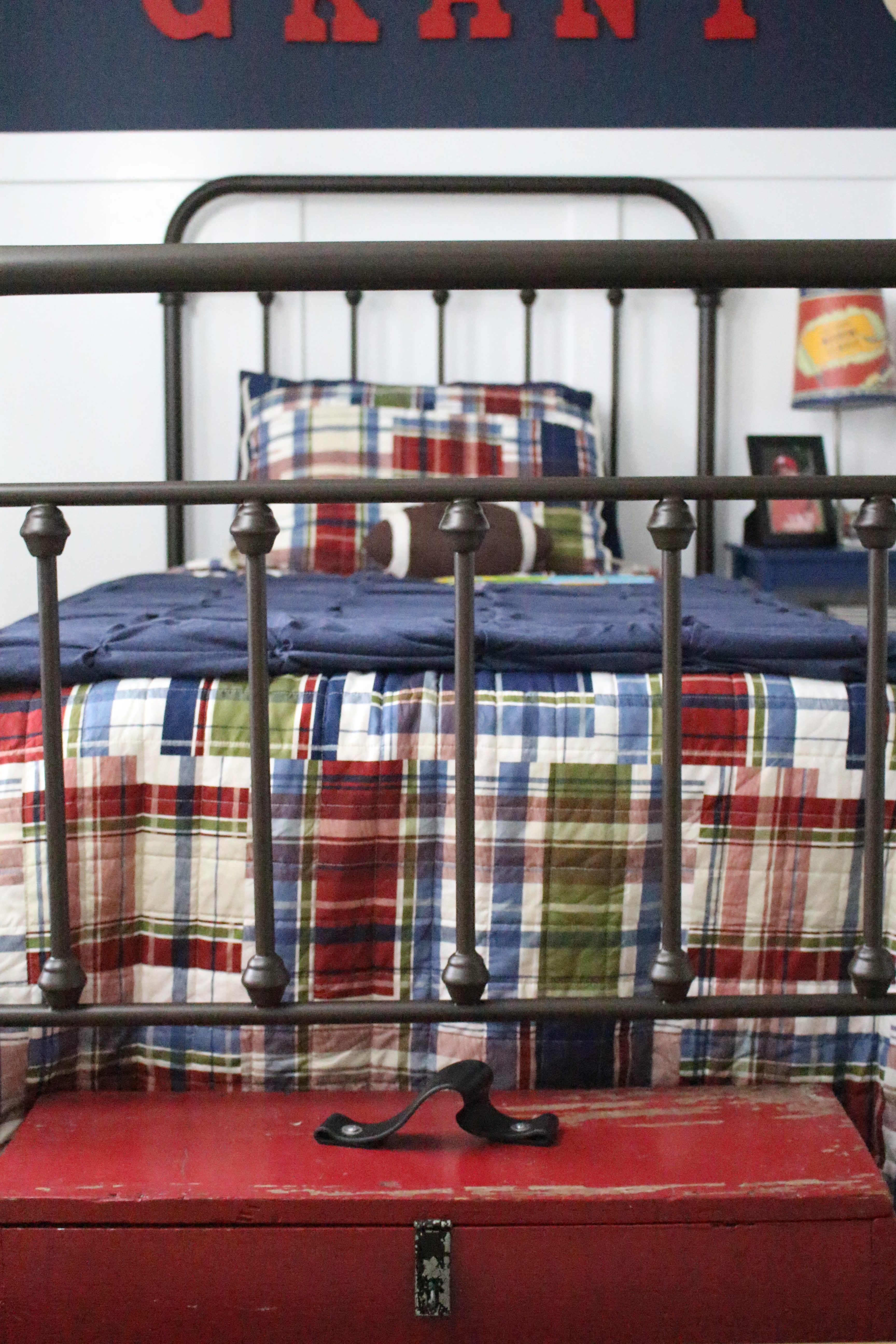
3. Mix inexpensive and expensive furnishings: This principal is one that I really like to use. I am a bargain shopper and love pairing my antique pieces with store bought or even thrift store items. I did this in Grant's bedroom where I bought several more expensive antique storage pieces, but also Target canvas bins. The combination works well.
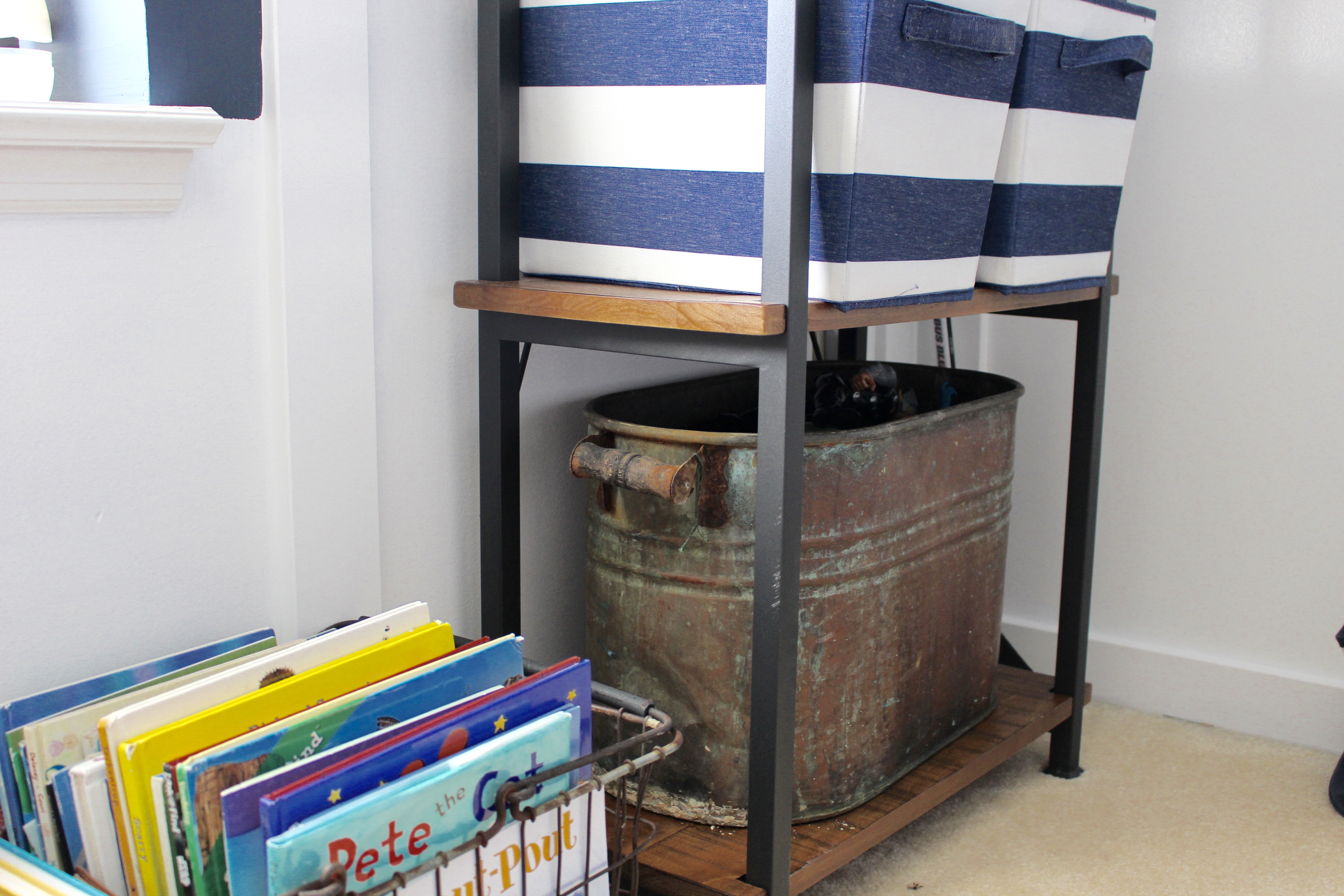
Just remember, not everything has to match! It's a much more interesting room if furnishings are not cookie cutter.
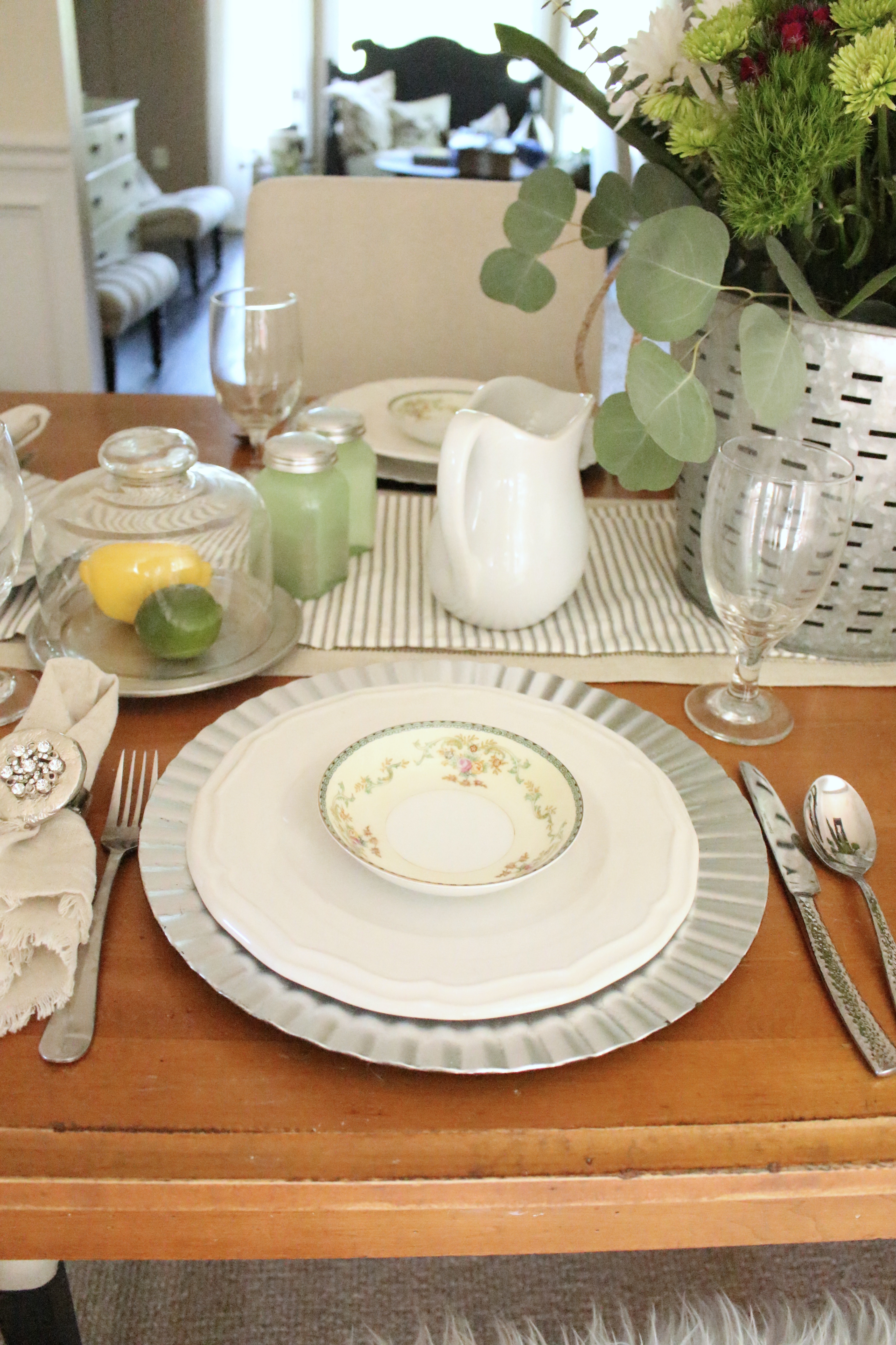
4. Use both fancy and everyday items together: I tend to use #1-3 more than #4 because I don't really own anything fancy! But if you do, using this idea can help in toning down your space from feeling to stuffy. A good example of this might be using your fancy china and pairing it with your everyday bowls, silverware, or glassware. I tend to like a more casual look and an all formal china setting is to formal for my style and home. I do however, like to pull out my fancy bowls like I did here and mix them with my everyday dishes and galvanized chargers.
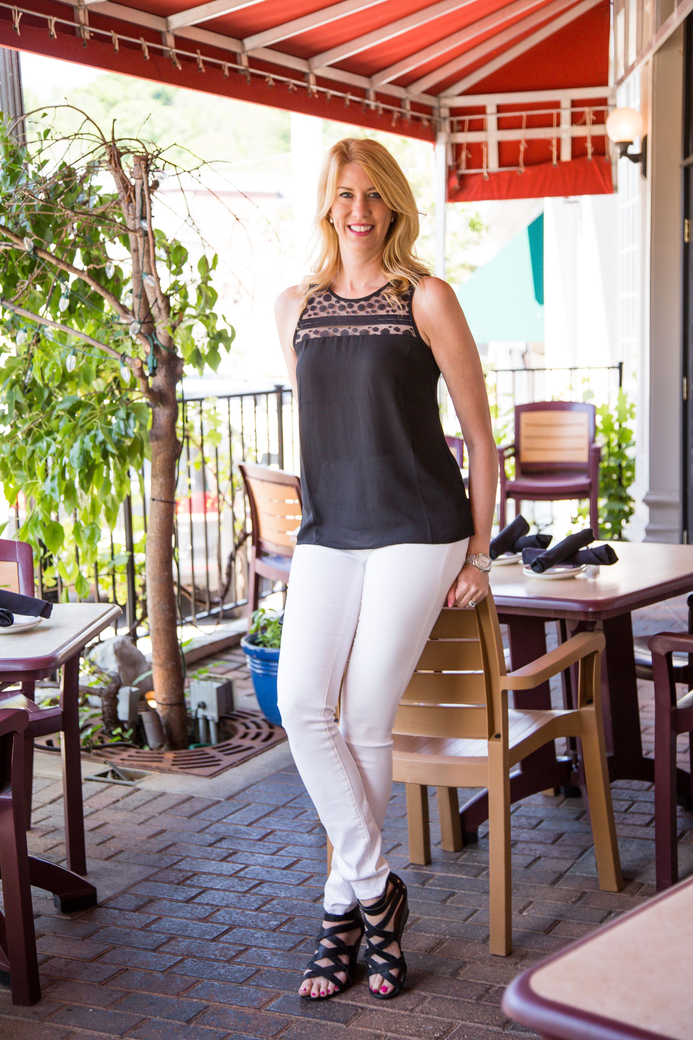
Ok, we've talked a lot about your home spaces, but guess what? The principal of contrast also works well in your wardrobe. One of my favorite looks is pairing white and black together. It is an exciting, memorable, combination that draws interest to your outfit. Always a classic!
Here is a post showing a black and white outfit combination.
{This post contains affiliate links, see full disclosure here.}


[…] Lingo Unplugged post. Last time, we talked about contrast. You can catch up on that post here. Today, we are going to talk about focal points. What a focal point is and how you can style your […]
Love your tips, Amy! I think I watched enough Candace Olson & Sarah Richardson on HGTV years ago to qualify for a 2-year degree at least 😉
Ha! I hear ya! I have always been a dedicated student of HGTV!
Great breakdown of décor meaning…love this post! sharing 🙂
Thank you, Kim! I hope it is helpful.