There is a particular shade of paint that sits right on the line between grey and beige, and once you see it on a wall, you understand immediately why people lose hours scrolling through paint swatches looking for exactly this colour. Valspar Goose Feathers is that shade. It is warm without veering into sandy territory, cool without feeling clinical, and it has the kind of quiet sophistication that makes a room feel considered rather than simply “painted.” Finding it was one of those small victories that genuinely changed the way our hallway feels, and after living with it for well over a year now, it is still the paint colour I recommend more than any other.
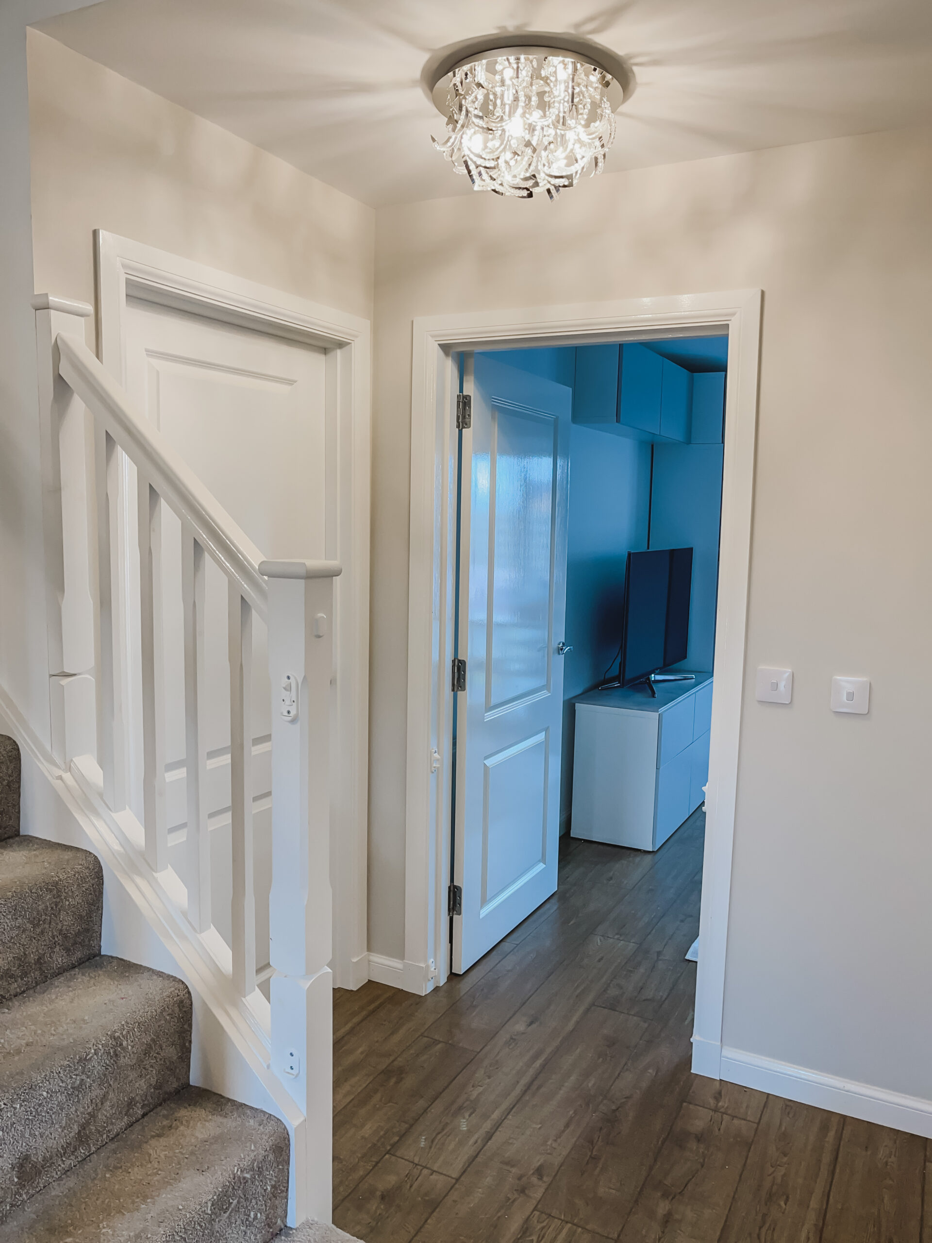
When we decided to tackle our hallway, the brief was simple: get rid of the stark white walls that made the whole space feel sterile, especially against the white woodwork. What we ended up with was a full project involving new flooring, a garage door installation, wainscotting, and, of course, finding the right wall colour to pull it all together. Valspar Goose Feathers was the final piece. It turned what had been a functional corridor into something that actually feels like part of the home.
What Colour Is Valspar Goose Feathers?
Valspar Goose Feathers is best described as a true greige, which means it sits perfectly between grey and beige without committing fully to either. In natural daylight, it reads as a soft, warm grey with the faintest hint of taupe running through it. Under artificial light, particularly warmer bulbs, the beige undertones come forward slightly, giving it a cosy, almost linen-like quality. It never looks cold, which is one of its greatest strengths, especially in a north-facing room or a hallway that does not get a lot of direct sunlight.
The undertones are what set Goose Feathers apart from so many other greige options. There is no pink lurking underneath (the bane of so many supposedly “neutral” greys), no green pulling through, and no purple cast. It is genuinely neutral. This makes it incredibly easy to pair with both warm and cool accent colours, which is exactly what you want from a paint that might end up as the backdrop for an entire ground floor.
If you have tried colours like Dulux Polished Pebble or Farrow & Ball Cornforth White and found them too cool, or looked at something like Dulux Perfectly Greige and found it too warm, Goose Feathers sits right in the sweet spot between them.
Valspar Goose Feathers Undertones
Understanding the undertones of any paint colour is the difference between loving it on the wall and wondering why it looks nothing like the swatch. With Valspar Goose Feathers, the dominant undertone is a warm taupe. It is not yellow-warm or pink-warm; it is that very specific, earthy warmth that reads as “natural” rather than “tinted.”
In a south-facing room with lots of natural light, Goose Feathers will lean slightly more towards its grey side. In a darker space, or under warm LED bulbs, the beige comes through more prominently. Neither version looks bad, which is the real test of a good neutral. Some paints shift so dramatically between lighting conditions that they feel like two different colours. Goose Feathers does shift, but it shifts within a range that still feels like itself.
One thing worth noting: if you are painting a room that gets almost no natural light, Goose Feathers will read warmer and slightly darker than you might expect from the swatch. It will not look brown, but it will have a richness to it that disappears in brighter spaces. For very dark rooms, you might want to test it alongside Valspar's Silver Birch, which offers a similar feel but with a lighter hand.
Where to Buy Valspar Goose Feathers
Valspar paint is available at B&Q stores across the UK and online. You can pick up Goose Feathers in a range of finishes and tin sizes, which makes it easy to match the right product to your project. For walls, the flat matt emulsion gives the most beautiful depth of colour and hides imperfections well. For woodwork, you would want to look at the Valspar wood and metal range and get the colour mixed to match.
One of the things that makes Valspar particularly good value is the coverage. A 2.5 litre tin comfortably covered our hallway walls with two coats, and the consistency of the paint itself is lovely to work with. It is not too thick, not too runny, and it goes on smoothly with both a roller and a brush. For a mid-range paint, the finish is genuinely impressive.
How I Used Valspar Goose Feathers in Our Hallway
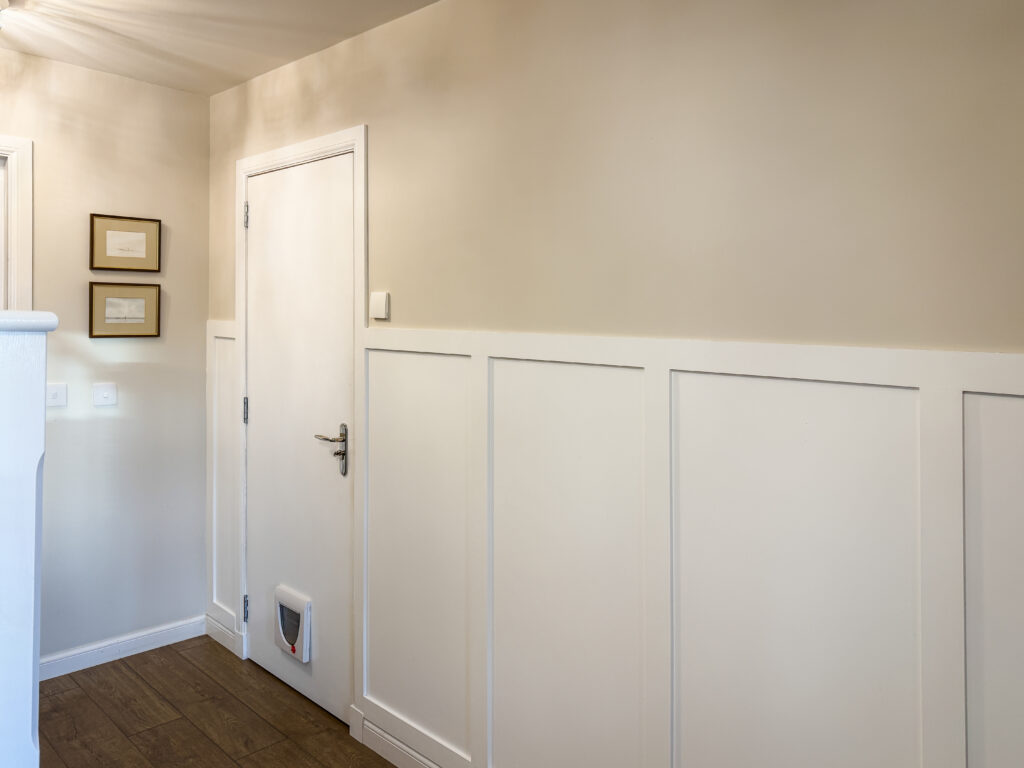
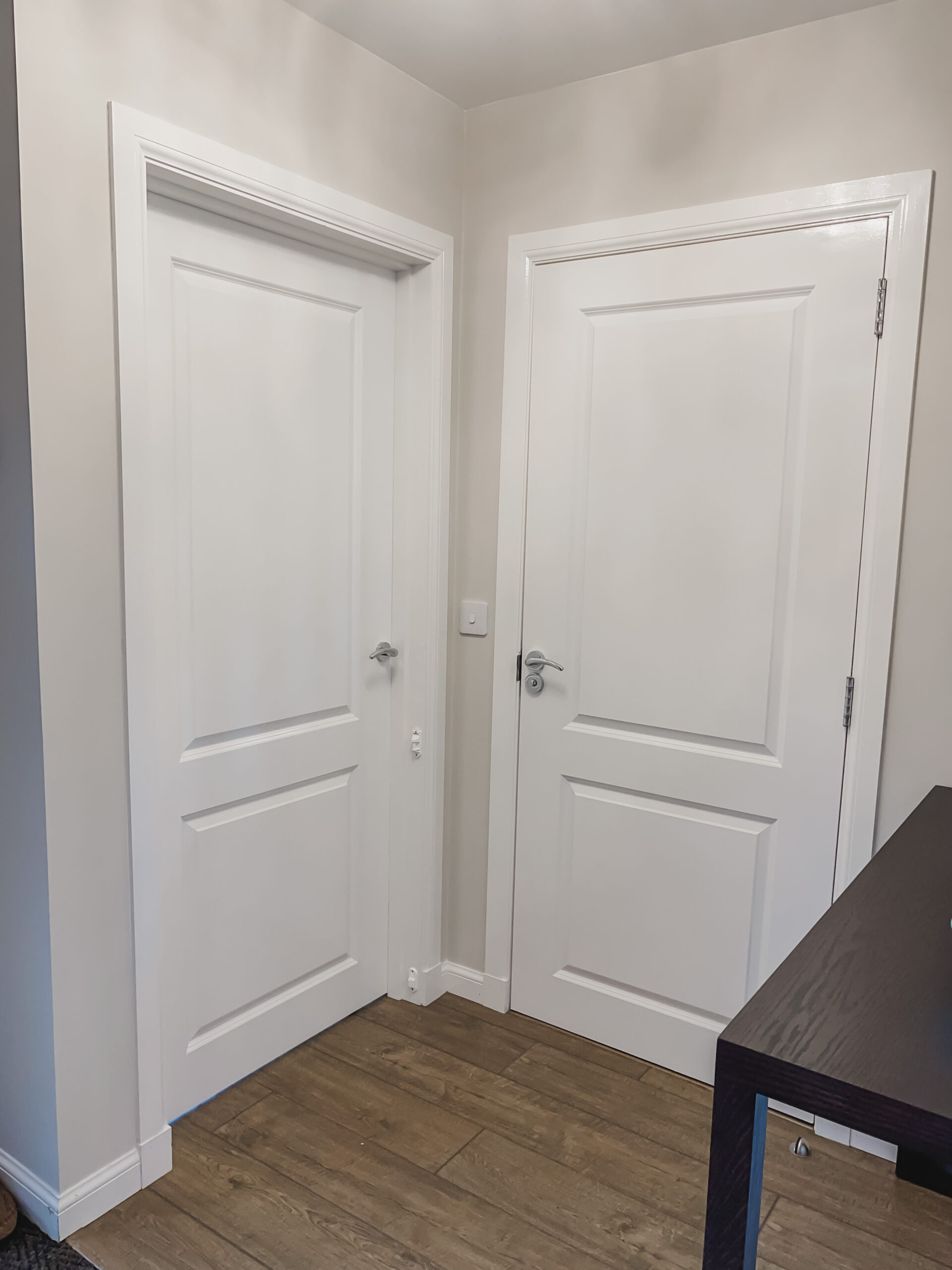
Our hallway project was more involved than just a fresh coat of paint, but Goose Feathers was the element that brought everything together. The space has six doors leading off it, which meant that painting the walls was essentially one long exercise in careful edging. Frog Tape was absolutely essential, and I would not attempt a project like this without it.
Before the paint went on, we added wainscotting to the lower half of the walls using MDF panels. The wainscotting was painted in a white gloss skirting paint to match the existing woodwork, and then Goose Feathers went on the upper walls above the panelling. The contrast between the crisp white woodwork and the soft greige walls is what gives the hallway that finished, considered look. It feels like the kind of detail you would see in a show home, but it was all done by hand over a couple of weekends.
The garage door was also part of this project. We had it installed with a cat flap (the glamour of real life), and priming a new wooden door turned out to be one of the most unpleasant DIY experiences of the whole renovation. Wood primer is thick, gloopy, and seemingly impossible to wash off skin. Pure dish soap was the only thing that worked, and even then it took several attempts. The actual painting, though, was the easy part. Once the primer was dry, the gloss went on beautifully, and the Goose Feathers above it looked perfect from the very first coat.
We also had new wooden flooring laid as part of the same project, along with magnetic door stops to replace the old rubber ones. The combination of warm wood flooring, white wainscotting, and Goose Feathers walls created exactly the look we were going for: warm, elevated, and cohesive.
Valspar Goose Feathers vs Dulux Goose Feathers
This is one of the most common points of confusion when searching for this colour. Dulux also has a shade called Goose Feather (without the “s”), and the two are not the same. The Dulux version tends to run slightly cooler and lighter, with more of a silver-grey feel compared to Valspar's warmer, more balanced greige. If you are specifically looking for that warm neutral that works in a hallway or living space, Valspar's version is the one to go for. The Dulux shade is lovely in its own right, but it is a different colour with a different feel, so it is worth double checking which brand you are looking at before committing to a full tin.
What Colours Go with Valspar Goose Feathers?
Because Goose Feathers is such a well-balanced neutral, it pairs beautifully with a wide range of accent colours. Crisp white woodwork is the most classic combination, and it is exactly what we used in our hallway. The white keeps everything fresh and stops the greige from feeling heavy.
For a richer, more layered look, deep navy or forest green accents work wonderfully against Goose Feathers. Think a navy front door, dark green cushions in a hallway bench, or brass hardware against the warm grey walls. Warm metallics like brass and copper feel particularly at home alongside this colour, as do natural materials like oak, rattan, and linen.
If you want to keep things light and airy, pair it with soft whites, pale oak furniture, and natural textures. The paint does the heavy lifting in terms of adding warmth, so you do not need to pile on warm accessories unless you want to.
Is Valspar Goose Feathers Good for Hallways?
Honestly, it is one of the best choices you could make for a hallway. Hallways are tricky spaces because they tend to be narrow, often lack natural light, and they connect rooms that may all be painted in different colours. You need a shade that feels welcoming without overpowering, and that works as a backdrop rather than a statement. Goose Feathers does exactly that.
The flat matt finish also hides scuffs and imperfections surprisingly well, which matters in a high-traffic area like a hallway. After well over a year of coats being brushed against the walls, bags being dumped, and the general chaos of daily life passing through, the paint still looks fresh. Touch-ups blend in seamlessly too, which is not something you can say about every paint.
For anyone considering painting their hallway and feeling overwhelmed by the sheer number of neutral options out there, Goose Feathers is the shade I would point you towards first. It is not trendy in a way that will date quickly, it works with almost any interior style, and it has that quiet, luxurious quality that makes you feel like the whole space has been professionally designed.
Frequently Asked Questions
Valspar Goose Feathers is a warm greige, sitting perfectly between grey and beige. It has soft taupe undertones with no pink, green, or purple cast, making it one of the most genuinely neutral paint colours available on the UK high street.
It leans warm, but only gently. The taupe undertones give it warmth without making it feel beige or sandy. In very bright, south-facing rooms it can read slightly cooler, but it never tips into cold grey territory.
Like all paint colours, it does shift slightly depending on the light. In natural daylight, it appears as a soft warm grey. Under warm artificial light, the beige undertones become more visible. Both versions are beautiful, and the shift is subtle rather than dramatic.
No. Despite the similar names, these are different colours from different brands. The Dulux version (Goose Feather, singular) tends to be cooler and lighter. The Valspar version (Goose Feathers, plural) is warmer and more balanced as a greige.
Valspar paint is stocked at B&Q stores across the UK and is also available online through the B&Q website. It comes in various finishes including flat matt for walls and a wood and metal range for woodwork.
White woodwork is the most classic pairing. It also works beautifully with navy, forest green, warm brass and copper metallics, natural oak, and linen textures. Because it is so well balanced, it complements both warm and cool accent colours.
It is an excellent hallway colour. The warm, neutral tone works in both light and darker spaces, pairs well with white woodwork, and the flat matt finish hides everyday scuffs and marks well. It creates a welcoming feel without overwhelming a narrow space.
Two coats gave us full, even coverage over previously white walls. If you are painting over a darker colour, you may need a coat of primer first, but for most situations two coats will be plenty.
If you are looking for more home and interiors inspiration, have a browse through the home interiors section for paint, DIY, and room makeover ideas.
Leave a Reply
The Sunday Letter
Most Sundays, once the house has gone quiet and it's edging towards nine, a letter goes out. It's the one I'd write to a friend with good taste and not nearly enough time: one thing worth reading, one thing worth buying, and one thing to skip. No noise, no pressure to spend, just the considered version of what I've actually been using, loving, or quietly sending back.
If you like the sort of recommendation that still holds up six months later, leave your email below and I'll write to you on Sunday.