White Cottage Kitchen Renovation Reveal
It's reveal time for my white cottage kitchen renovation. All the cottage details you want in a kitchen; white cabinets, open shelving, a custom wood island, and pops of color!
How many emojis can you put in one sentence, because today I am using them all! It's the BIG reveal day and I couldn't be more pleased with how our white cottage kitchen renovation turned out! It has been a process fraught with delays and complications, but we persevered and I am so happy to share it with you today! After 5 long months, the last and final pieces were installed this week and we are thrilled with the result. This kitchen has everything I ever dreamed of for a kitchen space. A combination of gray and white cabinets, a farmhouse sink, open and closed shelving, a custom island, a peninsula, a coffee station, a bar nook, and professional appliances. Girl! WE DID IT! PLUS, it has all the cottage charm and pops of color I need to satisfy my decor-loving heart.
Grab your coffee or favorite after 5 cocktail because this is a LONG post with as many photos as I could pack in! All the source details are linked at the bottom along with each and every post describing the design process.
White Cottage Kitchen Renovation Reveal
{This post contains affiliate links, see full disclosure, here.}
Let's start with the pretty photos!
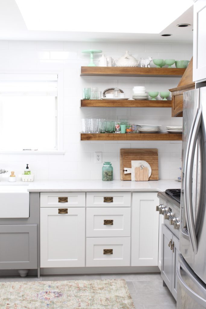
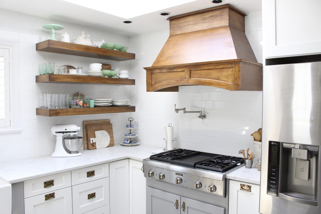
First, up is our cooking area with this gorgeous Thermador Professional Range top with a griddle! This is definitely my husband's favorite feature! I am really loving the convenience of the pot filler for filling large pots and he loves the griddle for Saturday morning eggs and pancakes!
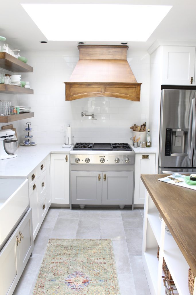

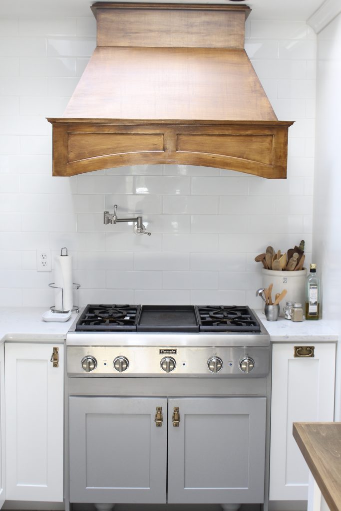
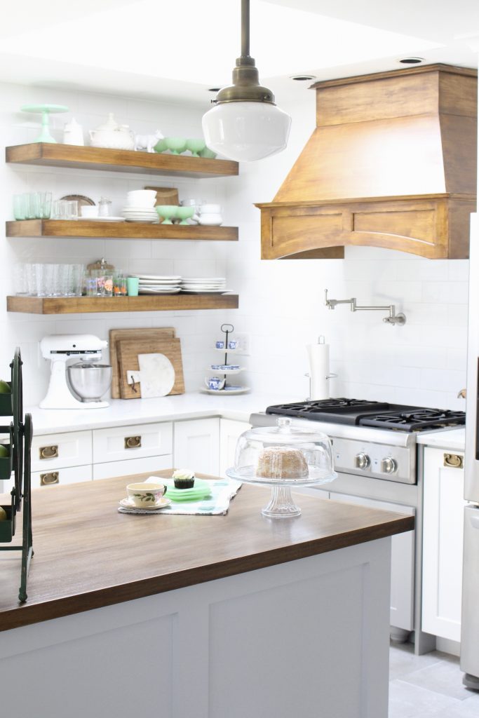
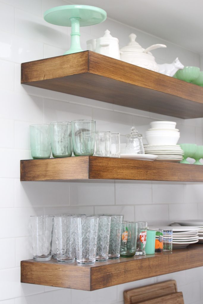
The open shelving makes it very convenient to grab dishes and glassware when we need it and my kids know exactly where things go when they help unload the dishwasher.
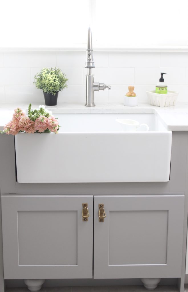
This gorgeous farmhouse sink and faucet from Elkay not only look pretty, but the depth of it hides dirty dishes away until I can get them washed. Makes me feel like the kitchen is clean even when it might not be! I'm really glad we decided to go with one large bowl instead of two because it makes it easy to wash large pots and trays.
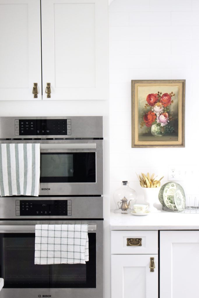
We went with a double oven combination from Bosch. The top oven also doubles as a microwave.
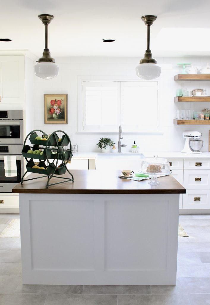
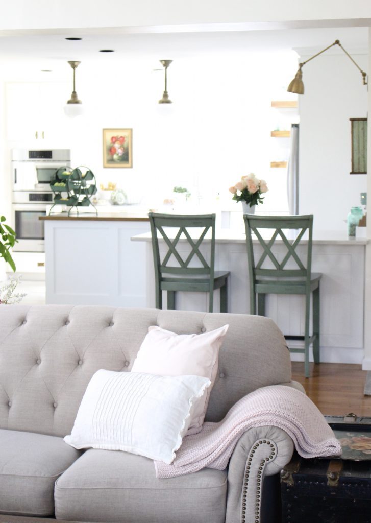
You can read all about this custom island and these gorgeous antique brass schoolhouse lights from Barn Light Electric in this POST. I used antique brass accents throughout the space to warm up the cool tones of the stainless steel and white. It adds not only a pop of color but warms up the room.
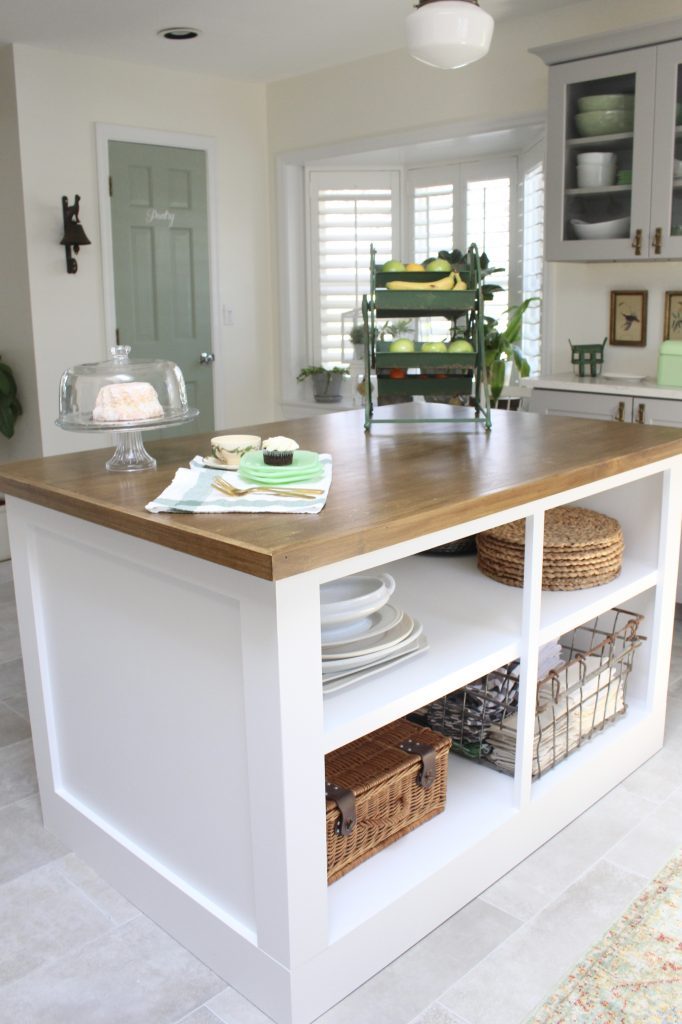

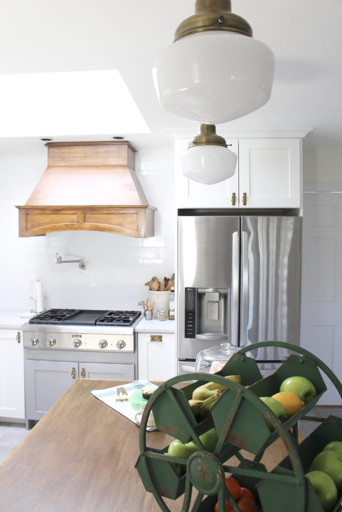
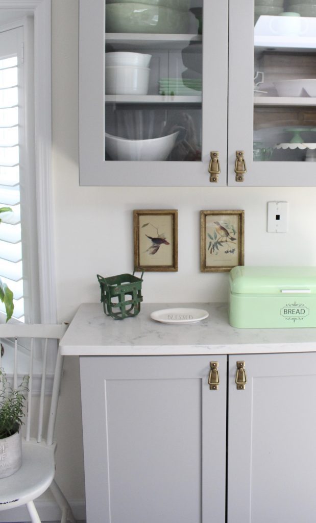
Moving around the space, on the exterior wall, we added a hutch in a pop of gray. I use this to store my green and white dishes that I do not use every day.
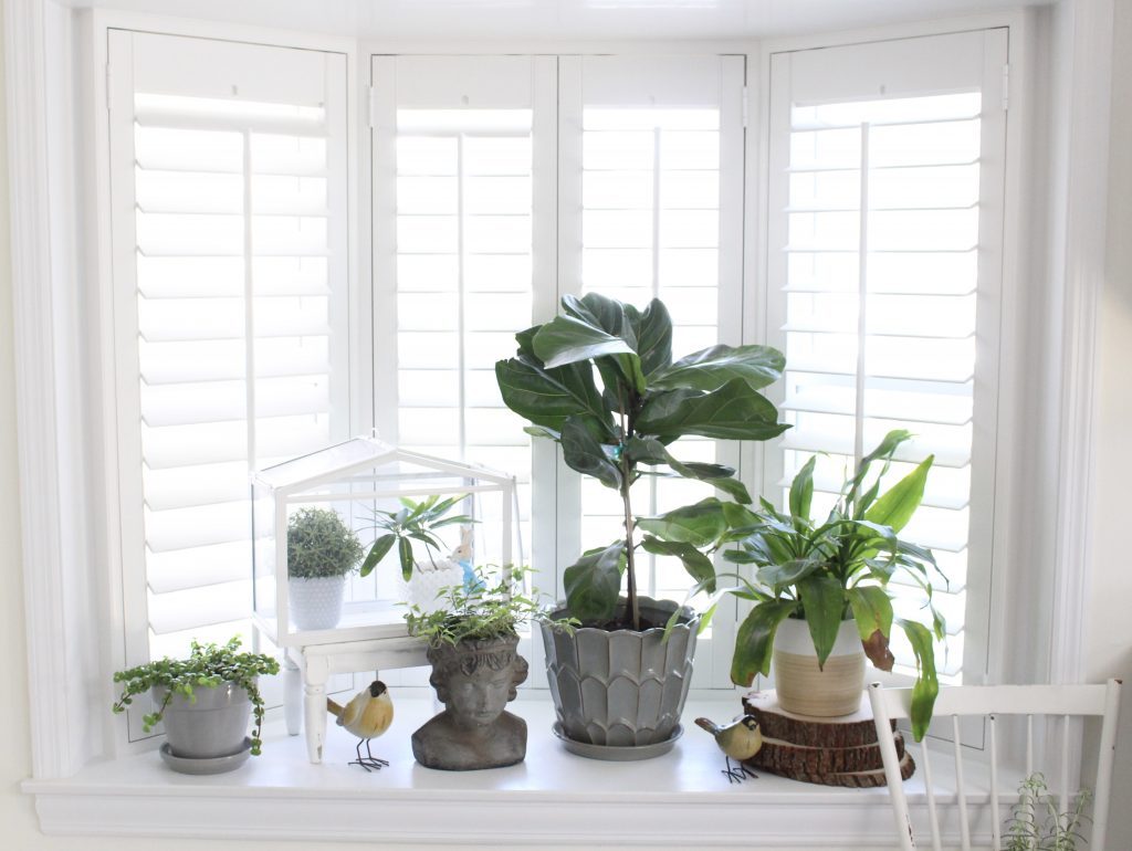
In the bay window, we added lots of plants. Can we stop for a moment and check out these incredible shutters that we had installed by Sunburst Shutters?! I'm going to do a full post on these next week. They were the final touch that really brought home the cozy factor and made this kitchen design all come together. I'm so in love with them!
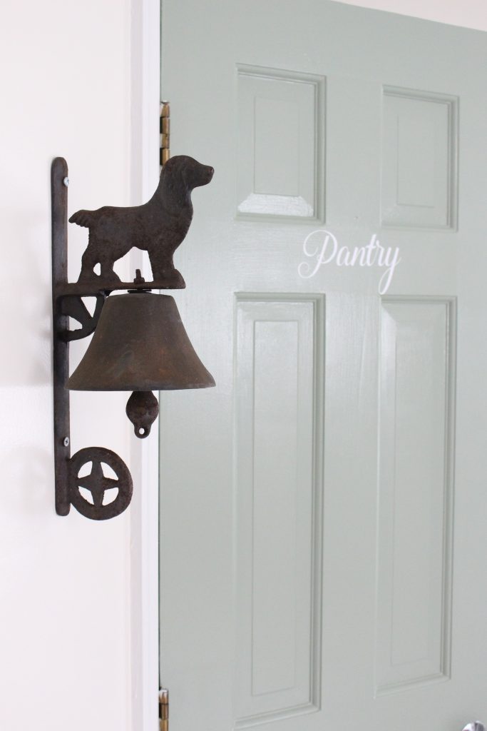
And for the very first time in my life, I have a walk-in pantry! Behind that green door is all kinds of shelves for storage.
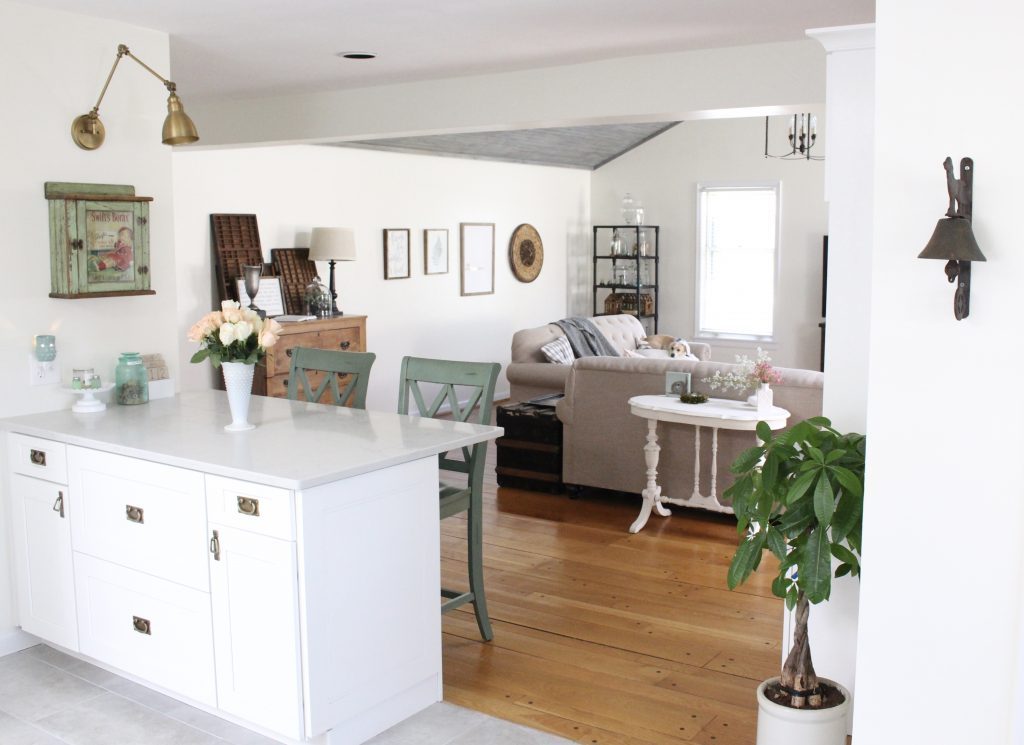
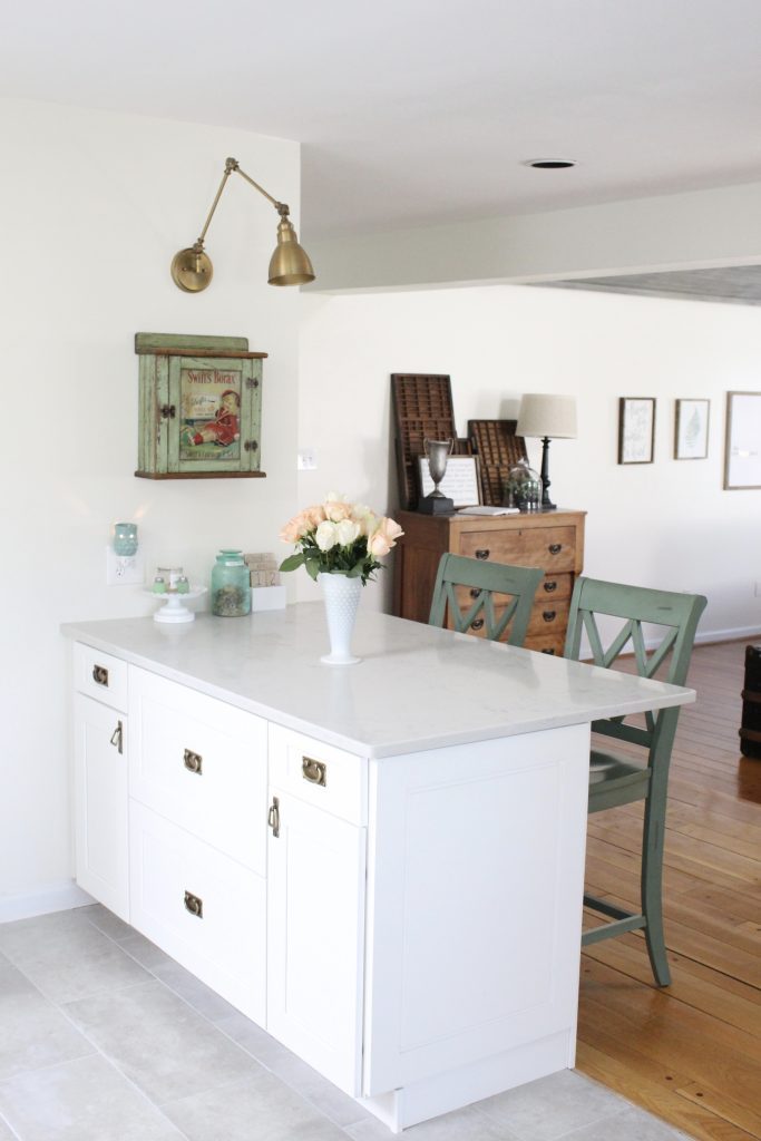
Having an extra little space as a bridge to the family room, I added a whole peninsula of large deep drawers and cabinets for extra storage and stools for seating. We use this area constantly for breakfast, snacks, and with the dining room right to the left of it, it's a perfect place to set up a serving station.
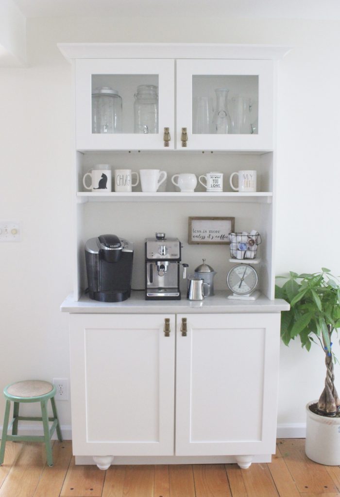
Another favorite little spot is our coffee bar. Greg and I really enjoy coffee and even whip up our own cappuccinos on the weekend. This is the Espresso machine we bought at Target and we love it! I use the top of the hutch to store my glass pitchers and carafes, in the cabinet underneath is extra coffee supplies.
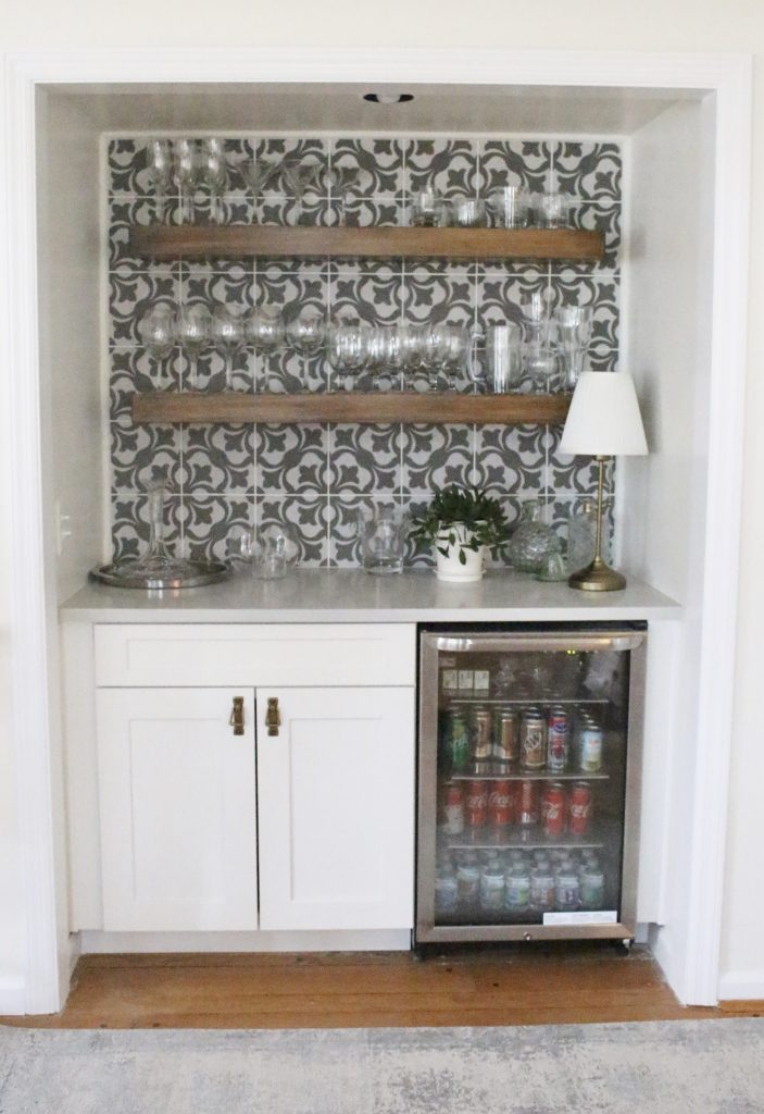
Lastly, facing the family room space is a wine and beverage bar nook. We used this fun Menza Gray tile from Home Depot and the same open shelving as the kitchen. Our beverage fridge is stocked full of sodas, juice boxes, and water to grab for movie watching!
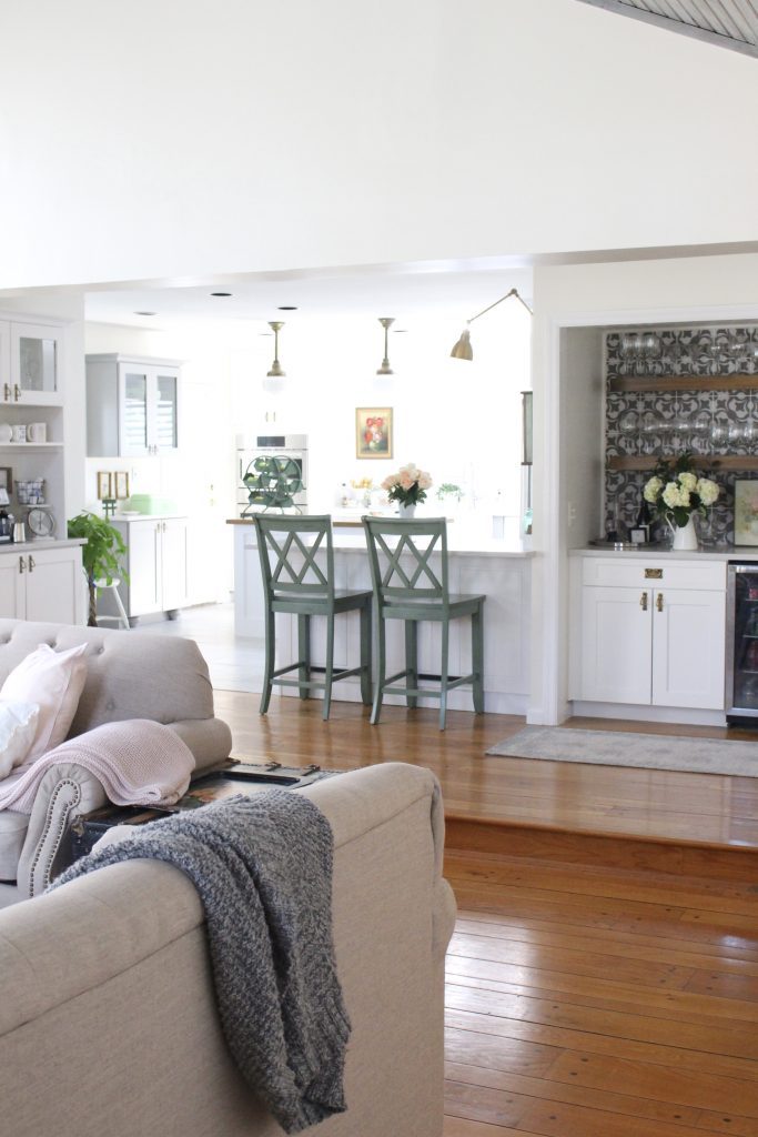
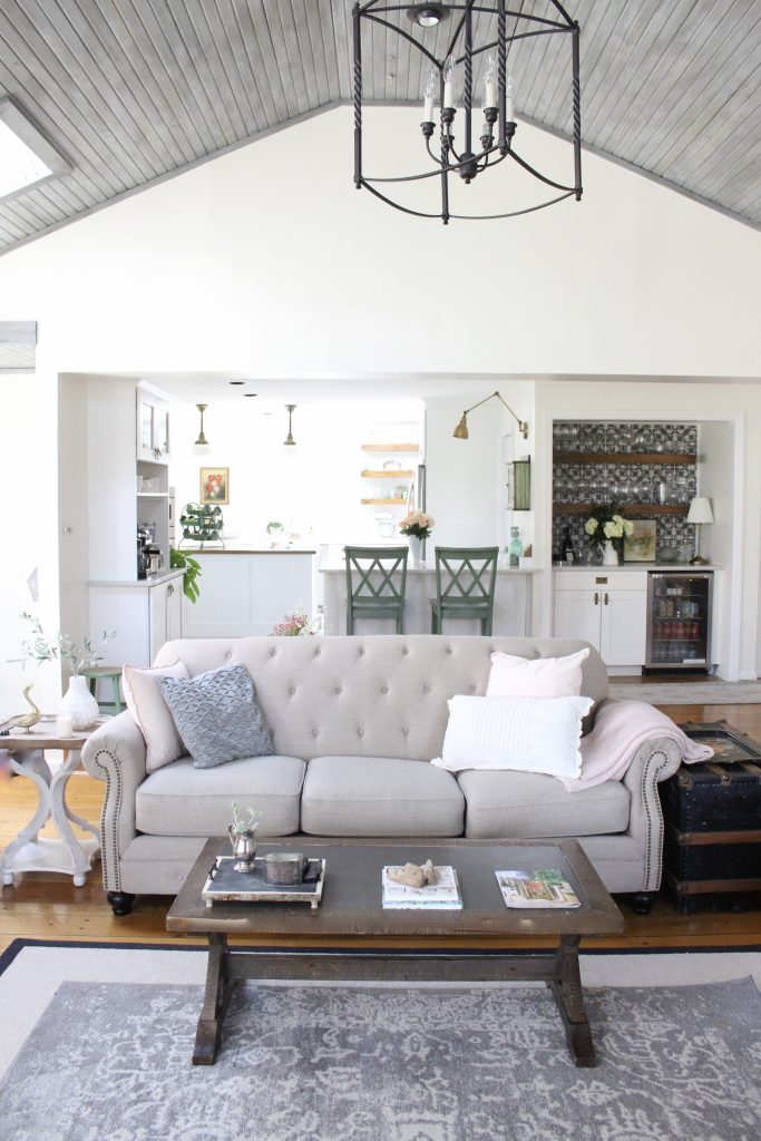
Here's a view from our family room of the whole space.
SOURCES:
Cabinets/ Shelves: American Woodmark through Home Depot.
Overhead Lighting: The Schoolhouse Brass Stem Mount Light
Tile (backsplash kitchen): 4×12 inch tile at Lowes.
Pulls: D. Lawless, Antique Brass Bail Pull, Antique Brass Horizontal Bail Pull
Sink: Elkay Fireclay 29-7/8″ x 19-3/4″ x 10-1/16″, Single Bowl Farmhouse Sink
Faucet: Elkay Explore Single Hole Kitchen Faucet in Lustrous Steel.
Counters: Ibiza White Quartz
Tile (backsplash bar nook): Menza Gray tile from Home Depot
You can also see more of my favorite finds found just on Amazon on my dedicated Life From Home Amazon page.
You can catch up on each and every kitchen renovation post, here: Kitchen Plans, Kitchen Inspiration & Favorite Finds, Warm & Inviting White Cottage Kitchen Renovation~ Midpoint Check-In, White Cottage Kitchen Renovation Countertops, The Perfect Farmhouse Sink and Faucet, Bar and Beverage Nook, Pretty Hardware, Rustic Shelves, and White Tile, and Schoolhouse Lighting and Custom Kitchen Island.
And I can't leave you without a good Before and After!
[easy-image-collage id=18970]
[easy-image-collage id=18971]
Thank you for hanging with me on this renovation! I know it was a long one! Looking for more? My Modern Farmhouse Bathroom Reno is everyone's favorite.
To life feeling like home!
XO,


[…] am still enjoying all the elements of the renovation we did 4 years ago. You can revisit the kitchen reveal (LINK) here, and (LINK) […]
what an amazing white cottage kitchen! Thanks for sharing really inspirational for others. Great piece of work
[…] Photo by Amy Dowling […]
[…] Photo by Amy Dowling […]
This turns out best… I love the wooden touch of it…
This kitchen is so beautiful! Reminds me of farmhouse to a tee! It’s unbelievably gorgeous! That range hood cover is insanely gorgeous too, and the white and wood accents really make the kitchen feel like home!
You’re correct! White color is simple yet elegant and stunning. The color combination is perfect! It adds more vibrant to your home. This is an extensive kitchen renovation. Keep it up!
I like how you applied a classic design for the exhaust fan of the stove. I like that it is applied in a smart manner as it is aligned with a white background to stand out. We will need an interior designer to help us in making smartly planned custom kitchen cabinets.
You’re correct! White color is simple yet elegant and stunning. The color combination is perfect! It adds more vibrant to your home. This is an extensive kitchen renovation. Keep it up!
This is a beautiful kitchen and i love the neutral colors you chose because it makes it very easy to decorate and change out decor through the year. Very pretty and I wish I had a double oven again but oh well.
You’re correct! White color is simple yet elegant and stunning. The color combination is perfect! It adds more vibrant to your home. This is an extensive kitchen renovation. Keep it up!
[…] shelf and once I got it home and styled, I love it even more! When we remodeled our kitchen (see the whole reveal here, LINK), we added a peninsula where there wasn’t one. We installed this brass swing arm […]
I love you backsplash! Also you the center island is what I am dreaming for. Those shelves were also beautiful. I can now picture out my dream kitchen. I will be starting tomorrow to redesign my kitchen. Wish me luck!
Great looking kitchen renovation. It looks so classy and sophisticated. Really nice. Great job.
Look awesome. What kind of paint did you use?
For the walls, we used SW Alabaster. It’s a beautiful white with a creamy undertone.
[…] the kitchen (LINK), I have used an extra stool I picked up at an antique booth to hold one of my plants. Then if […]
[…] […]
[…] We did a complete remodel of the kitchen. We removed all the cabinets and appliances, reworked the space to include open shelving, new appliances, a custom island, coffee bar, and added an additional peninsula space with seating as a breakfast bar. We painted the whole space Alabaster by Sherwin Williams. Around the corner, we redid the wet bar into a wine and beverage nook. You can see the full White Cottage Kitchen Renovation Reveal, here (LINK). […]
I loved that! Just one quick question – I thought that open shelving results in much dust. Is it so? I didn’t choose it just because of that.
Yes and no. The bottom 2 shelves are things we use all the time so I don’t notice much dust. The top shelf, I do wipe down the items when I use those.
Wow, Mindblowing. It’s an excellent kitchen renovation and some outstanding kitchen design guide. This tips will help me which kitchen design would be better for me. I like your great idea. Thanks for sharing this helpful idea.
[…] You can see the full white cottage kitchen remodel here (LINK). […]
[…] White Cottage Kitchen Renovation Reveal | My Life From Home on Instagram […]
Amy, your kitchen is stunning! I can’t get over the difference from your “before” photos! All of the details are perfect, down to the pulls and handles you chose, and all of your decorative touches! I bet you’re going to love this space for years to come!
Thank you! It’s a dream come true!
[…] UPDATE: Come see the White Cottage Kitchen Renovation Reveal! […]
[…] UPDATE: Come see the White Cottage Kitchen Renovation Reveal! […]
[…] UPDATE: Come see the White Cottage Kitchen Renovation Reveal! […]
[…] UPDATE: Come see the White Cottage Kitchen Renovation Reveal! […]
[…] UPDATE: Come see the White Cottage Kitchen Renovation Reveal! […]
[…] UPDATE: Come see the White Cottage Kitchen Renovation Reveal! […]
[…] UPDATE: Come see the White Cottage Kitchen Renovation Reveal! […]
[…] UPDATE: Come see the White Cottage Kitchen Renovation Reveal! […]
[…] UPDATE: Come see the White Cottage Kitchen Renovation Reveal! […]
I just love this white cottage kitchen renovation. These pictures are looking very beautiful.
wow, looks great.A+ on the photography.
OMG AMY!!! I can’t believe how much you’ve gotten done in such a small amount of time. Looks amazing. Congrats,!